 bizdif.com
 Mobile optimization enhances e-commerce sites by improving load times, navigation, and user experience on smartphones and tablets, catering to the majority of online shoppers who use mobile devices. Desktop optimization focuses on leveraging larger screen sizes and more powerful hardware to display detailed product information and advanced features, appealing to users browsing in a more deliberate and comprehensive manner. Prioritizing mobile optimization boosts conversion rates and reduces bounce rates, while desktop optimization supports in-depth browsing and multitasking capabilities.
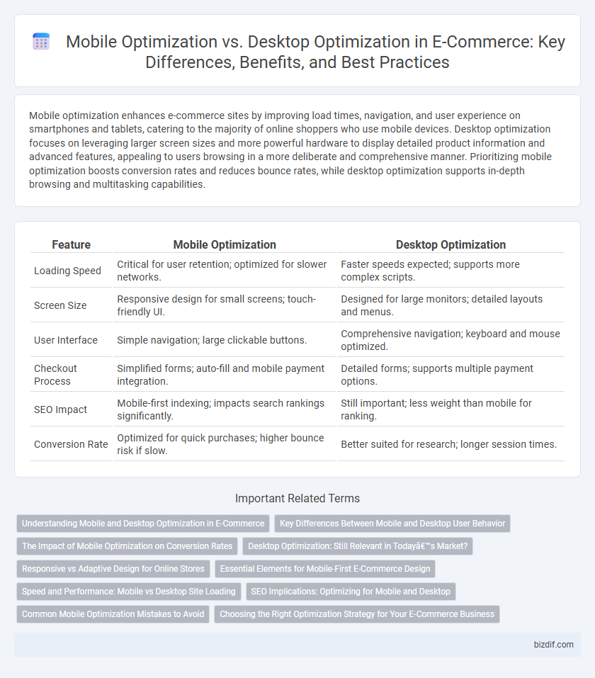
Table of Comparison
| Feature | Mobile Optimization | Desktop Optimization |
|---|---|---|
| Loading Speed | Critical for user retention; optimized for slower networks. | Faster speeds expected; supports more complex scripts. |
| Screen Size | Responsive design for small screens; touch-friendly UI. | Designed for large monitors; detailed layouts and menus. |
| User Interface | Simple navigation; large clickable buttons. | Comprehensive navigation; keyboard and mouse optimized. |
| Checkout Process | Simplified forms; auto-fill and mobile payment integration. | Detailed forms; supports multiple payment options. |
| SEO Impact | Mobile-first indexing; impacts search rankings significantly. | Still important; less weight than mobile for ranking. |
| Conversion Rate | Optimized for quick purchases; higher bounce risk if slow. | Better suited for research; longer session times. |
Understanding Mobile and Desktop Optimization in E-Commerce
Mobile optimization in e-commerce ensures fast loading times, responsive design, and seamless navigation tailored for smartphones and tablets, directly enhancing user experience and conversion rates. Desktop optimization focuses on high-resolution visuals, detailed product information, and multi-tasking capabilities that leverage larger screens to engage users effectively. Understanding the distinct requirements of mobile and desktop platforms allows e-commerce businesses to create targeted strategies that maximize reach, improve performance metrics, and drive revenue growth.
Key Differences Between Mobile and Desktop User Behavior
Mobile users typically exhibit shorter attention spans and favor quick, streamlined interactions, emphasizing ease of navigation and fast load times. Desktop users engage in more detailed browsing, often comparing products extensively and using larger screens to view multiple tabs or windows simultaneously. Understanding these behavioral differences guides e-commerce strategies to tailor user interfaces, optimize content layout, and enhance conversion rates specific to each device type.
The Impact of Mobile Optimization on Conversion Rates
Mobile optimization significantly increases e-commerce conversion rates by providing faster load times, intuitive navigation, and seamless checkout experiences tailored for smaller screens. Studies reveal that mobile-optimized sites see conversion rates up to 50% higher compared to non-optimized counterparts due to improved user engagement and reduced bounce rates. Ensuring responsive design and mobile-friendly payment options directly influences customer satisfaction and drives revenue growth in competitive online markets.
Desktop Optimization: Still Relevant in Today’s Market?
Desktop optimization remains crucial in e-commerce as a significant portion of online sales--approximately 40%--still originate from desktop users who prefer larger screens for detailed product research and secure checkout processes. Enhanced desktop experiences with faster load times, intuitive navigation, and high-resolution visuals contribute to higher conversion rates and average order values compared to mobile. Despite the rise of mobile shopping, desktop platforms offer superior capabilities for complex tasks, making desktop optimization a vital strategy for maximizing revenue and customer satisfaction in today's market.
Responsive vs Adaptive Design for Online Stores
Responsive design in e-commerce online stores uses flexible grids and images to ensure seamless display and usability across all device sizes, enhancing mobile optimization by automatically adjusting layout based on screen dimensions. Adaptive design employs fixed layouts tailored to specific device categories, optimizing performance by delivering distinct versions for mobile and desktop users, which can improve load times and user experience on targeted devices. Prioritizing responsive design supports consistent user engagement on diverse devices, while adaptive design allows for more customized interfaces that cater to specific user environments in online retail.
Essential Elements for Mobile-First E-Commerce Design
Mobile-first e-commerce design prioritizes fast loading times, intuitive navigation, and responsive layouts tailored to varied screen sizes to enhance user experience and conversion rates. Essential elements include touch-friendly buttons, streamlined checkout processes, and optimized images to reduce data consumption and improve performance on mobile networks. Focusing on these components ensures seamless shopping experiences, driving higher engagement and sales through mobile devices compared to desktop platforms.
Speed and Performance: Mobile vs Desktop Site Loading
Mobile optimization significantly improves site loading speed by reducing image sizes and leveraging adaptive design, resulting in faster performance compared to desktop sites that often handle larger media files and complex layouts. Desktop optimization benefits from more powerful processors and stable connections, enabling smoother navigation despite heavier content. Prioritizing fast load times on mobile platforms enhances user experience and conversion rates, as mobile users expect near-instant access to e-commerce sites.
SEO Implications: Optimizing for Mobile and Desktop
Mobile optimization significantly enhances user experience and search engine rankings by ensuring fast loading times, responsive design, and seamless navigation on various devices. Desktop optimization remains crucial for in-depth content presentation, detailed product descriptions, and complex interactions, supporting higher engagement from users with larger screens. Balancing SEO strategies between mobile-first indexing and desktop usability maximizes organic traffic and conversion rates across diverse user environments.
Common Mobile Optimization Mistakes to Avoid
Neglecting responsive design, slow loading times, and poor touch interface usability are common mobile optimization mistakes that hinder e-commerce conversion rates. Overloading mobile pages with excessive content or uncompressed images leads to increased bounce rates and diminished user engagement. Ensuring streamlined navigation, quick load speeds, and mobile-friendly layouts enhances the shopping experience and boosts online sales.
Choosing the Right Optimization Strategy for Your E-Commerce Business
Mobile optimization enhances user experience by ensuring fast loading times, responsive design, and simplified navigation tailored to smaller screens, which is crucial as over 60% of e-commerce traffic now comes from mobile devices. Desktop optimization remains important for complex product displays and detailed browsing, with larger screen real estate facilitating multitasking and comparison shopping. Choosing the right optimization strategy involves analyzing your target audience's behavior and purchase patterns, prioritizing mobile-first design if the majority of visitors use smartphones, or maintaining a balanced approach to serve both platforms effectively.
Mobile Optimization vs Desktop Optimization Infographic