 bizdif.com
 Mobile-first courses prioritize responsive design and touch-friendly navigation, ensuring seamless learning on smartphones and tablets. Desktop-optimized courses offer richer multimedia experiences and detailed layouts suited for larger screens and precise input devices. Choosing mobile-first design enhances accessibility and engagement for learners on-the-go, while desktop optimization caters to users seeking in-depth interaction and comprehensive content.
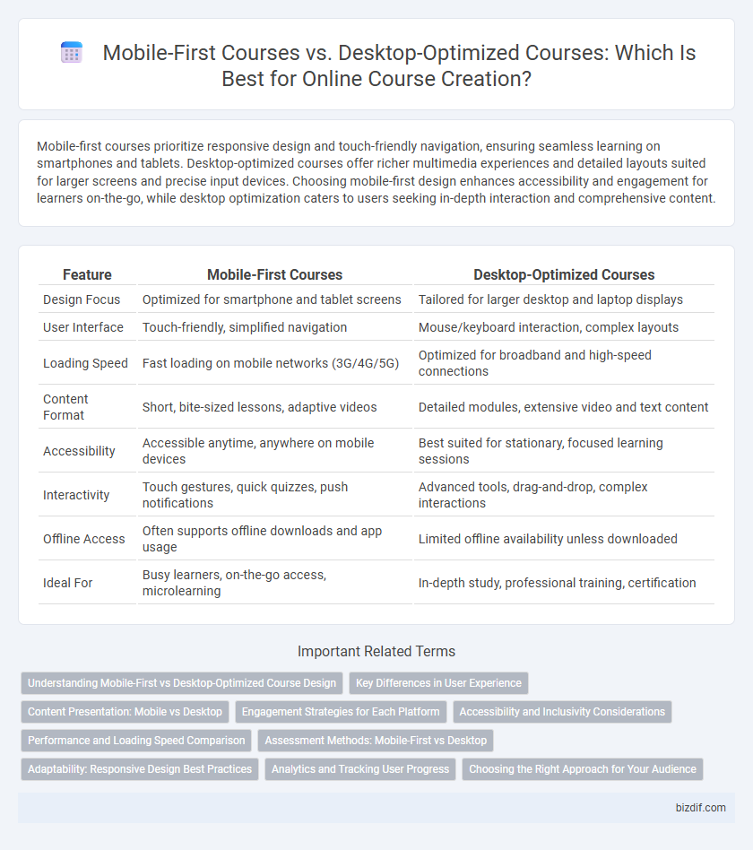
Table of Comparison
| Feature | Mobile-First Courses | Desktop-Optimized Courses |
|---|---|---|
| Design Focus | Optimized for smartphone and tablet screens | Tailored for larger desktop and laptop displays |
| User Interface | Touch-friendly, simplified navigation | Mouse/keyboard interaction, complex layouts |
| Loading Speed | Fast loading on mobile networks (3G/4G/5G) | Optimized for broadband and high-speed connections |
| Content Format | Short, bite-sized lessons, adaptive videos | Detailed modules, extensive video and text content |
| Accessibility | Accessible anytime, anywhere on mobile devices | Best suited for stationary, focused learning sessions |
| Interactivity | Touch gestures, quick quizzes, push notifications | Advanced tools, drag-and-drop, complex interactions |
| Offline Access | Often supports offline downloads and app usage | Limited offline availability unless downloaded |
| Ideal For | Busy learners, on-the-go access, microlearning | In-depth study, professional training, certification |
Understanding Mobile-First vs Desktop-Optimized Course Design
Mobile-first course design prioritizes seamless functionality and user experience on smartphones and tablets, recognizing that over 50% of global e-learning engagement occurs on mobile devices. Desktop-optimized courses, by contrast, leverage larger screens for enhanced multimedia integration and complex navigation but risk reduced accessibility for mobile users. Effective online course creation involves balancing responsive design techniques to ensure content adaptability, usability, and engagement across all device types.
Key Differences in User Experience
Mobile-first courses prioritize touch-friendly navigation, concise content, and responsive design to accommodate smaller screens and varying network speeds, ensuring accessibility on smartphones and tablets. Desktop-optimized courses leverage larger screen real estate with detailed layouts, multi-window support, and advanced multimedia features, enhancing engagement for users in fixed locations. User experience diverges as mobile-first design emphasizes quick, on-the-go learning moments, while desktop optimization supports in-depth study sessions requiring attention and interaction.
Content Presentation: Mobile vs Desktop
Mobile-first courses prioritize concise, visually engaging content with streamlined navigation to enhance usability on smaller screens, ensuring quick access and readability. Desktop-optimized courses leverage larger displays for detailed layouts, richer multimedia integration, and extensive content presentation, facilitating in-depth learning experiences. Content presentation must adapt to device-specific user interactions and screen sizes to maximize engagement and comprehension.
Engagement Strategies for Each Platform
Mobile-first courses leverage bite-sized content, interactive quizzes, and push notifications to maintain learner engagement in short bursts, optimizing usability for on-the-go access. Desktop-optimized courses utilize richer multimedia, detailed progress tracking, and collaborative forums to foster deeper focus and sustained interaction during dedicated study sessions. Tailoring engagement strategies to each platform enhances learner retention and satisfaction by aligning with device-specific user behaviors.
Accessibility and Inclusivity Considerations
Mobile-first courses prioritize touchscreen navigation, responsive design, and adaptable content layouts to ensure accessibility for users with varying device capabilities, including those relying on screen readers or voice commands. Desktop-optimized courses often provide richer multimedia experiences but may lack flexibility for users who depend on mobile accessibility features or have limited device options. Designing with inclusivity in mind requires balancing mobile accessibility standards, such as larger touch targets and simplified interfaces, alongside desktop functionalities to accommodate diverse learning environments and abilities.
Performance and Loading Speed Comparison
Mobile-first courses prioritize lightweight design and streamlined content to ensure faster loading speeds on varied mobile networks, significantly enhancing user engagement and reducing bounce rates. Desktop-optimized courses often leverage higher processing power and bandwidth, allowing for richer multimedia content but may suffer from slower load times on mobile devices if not adapted. Performance metrics reveal that mobile-first courses consistently outperform desktop-optimized versions in loading speed, crucial for retaining learners accessing content via smartphones.
Assessment Methods: Mobile-First vs Desktop
Mobile-first courses utilize touch-friendly, interactive quizzes and short video assessments optimized for smaller screens, enhancing user engagement on smartphones and tablets. Desktop-optimized courses often feature more complex assessment methods, including detailed simulations, drag-and-drop exercises, and multi-window tests suited for larger displays. Prioritizing mobile-friendly assessment tools increases accessibility and completion rates among learners who primarily access content via mobile devices.
Adaptability: Responsive Design Best Practices
Mobile-first courses prioritize responsive design, ensuring seamless adaptability across various screen sizes and devices for optimal user experience. Desktop-optimized courses often lack flexibility, leading to usability issues on smaller screens and reduced engagement. Implementing fluid grids, flexible images, and media queries in course design enhances accessibility and maintains content integrity regardless of device.
Analytics and Tracking User Progress
Mobile-first courses leverage advanced analytics to capture real-time user engagement metrics, enabling precise tracking of learner progress across diverse devices. These courses utilize responsive design and adaptive tracking tools to ensure consistent data accuracy and seamless progress synchronization between mobile and desktop platforms. Desktop-optimized courses often provide detailed interaction data but may lack the fluid adaptability and comprehensive cross-device tracking inherent in mobile-first learning environments.
Choosing the Right Approach for Your Audience
Mobile-first courses prioritize responsive design and simplified navigation to enhance accessibility for learners on smartphones and tablets, critical for audiences frequently using mobile devices. Desktop-optimized courses leverage larger screens and advanced features, suitable for users who prefer in-depth content consumption with multitasking capabilities. Analyzing learner demographics and device preferences ensures selecting the optimal course format, improving engagement and course completion rates.
Mobile-first courses vs Desktop-optimized courses Infographic