 bizdif.com
 Mobile-first design prioritizes creating online courses optimized for smaller screens and touch interactions, ensuring accessibility and smooth navigation on smartphones and tablets. Desktop-first design starts with layouts tailored for larger screens, often leading to richer visuals but potential challenges in adapting content for mobile devices. Choosing mobile-first enhances user engagement by catering to the increasing number of learners accessing courses via mobile, while desktop-first can benefit complex content requiring detailed interfaces.
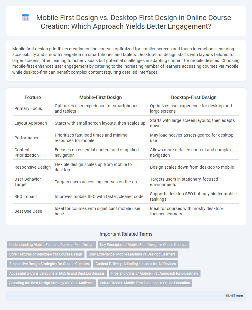
Table of Comparison
| Feature | Mobile-First Design | Desktop-First Design |
|---|---|---|
| Primary Focus | Optimizes user experience for smartphones and tablets | Optimizes user experience for desktop and large screens |
| Layout Approach | Starts with small screen layouts, then scales up | Starts with large screen layouts, then adapts down |
| Performance | Prioritizes fast load times and minimal resources for mobile | May load heavier assets geared for desktop use |
| Content Prioritization | Focuses on essential content and simplified navigation | Allows more detailed content and complex navigation |
| Responsive Design | Flexible design scales up from mobile to desktop | Design scales down from desktop to mobile |
| User Behavior Target | Targets users accessing courses on-the-go | Targets users in stationary, focused environments |
| SEO Impact | Improves mobile SEO with faster, cleaner code | Supports desktop SEO but may hinder mobile rankings |
| Best Use Case | Ideal for courses with significant mobile user base | Ideal for courses with mostly desktop-focused learners |
Understanding Mobile-First and Desktop-First Design
Mobile-first design prioritizes creating seamless, responsive learning experiences optimized for smartphones and tablets, ensuring accessibility and usability on smaller screens. Desktop-first design focuses on building course content with larger screens in mind, often resulting in richer visuals and complex interactions that may not translate well to mobile devices. Understanding the differences helps course creators tailor their content structure, navigation, and multimedia for the primary device their learners use, improving engagement and retention.
Key Principles of Mobile-First Design in Online Courses
Mobile-first design in online courses prioritizes responsive layouts that adapt seamlessly to smaller screens, ensuring readability and navigation ease on smartphones and tablets. Key principles include simplified content presentation, touch-friendly interfaces, and optimized loading speeds to enhance user engagement and reduce bounce rates. Emphasizing mobile accessibility boosts course completion rates by catering to learners who predominantly use mobile devices.
Core Features of Desktop-First Course Design
Desktop-first course design prioritizes a comprehensive layout that leverages larger screen real estate to showcase core features such as interactive modules, detailed navigation menus, and advanced multimedia content. Emphasizing high-resolution graphics, drag-and-drop functionalities, and multi-window support enhances user engagement and accessibility for learners on desktop platforms. This approach supports complex workflows and rich media integration, offering a robust learning environment tailored for desktop users.
User Experience: Mobile Learners vs Desktop Learners
Mobile-first design prioritizes intuitive navigation, responsive layouts, and fast loading times to enhance the learning experience for mobile users, who often access content on smaller screens and variable network conditions. Desktop-first design emphasizes detailed content presentation, larger visual elements, and multitasking capabilities suited for users engaging with material on bigger screens and stable internet connections. Understanding these differences ensures course creators optimize usability, engagement, and accessibility tailored to mobile learners seeking convenience and desktop learners requiring depth.
Responsive Design Strategies for Course Creators
Mobile-first design prioritizes smaller screens, ensuring online courses deliver smooth user experiences on smartphones and tablets by optimizing content layout and navigation. Desktop-first design targets larger screens initially, then adapts to mobile devices, which can result in slower load times and less intuitive interfaces on phones. Course creators should adopt responsive design strategies that dynamically adjust multimedia elements, fonts, and interaction points to improve accessibility and engagement across all devices.
Content Delivery: Adapting Lessons for All Devices
Mobile-first design ensures online courses are optimized for smaller screens, enhancing readability and navigation by prioritizing essential content and interactive elements. Desktop-first design allows for more detailed layouts and richer media but may require significant adjustments for mobile accessibility. Adapting lessons across all devices improves learner engagement and retention by providing seamless content delivery irrespective of screen size.
Accessibility Considerations in Mobile and Desktop Designs
Mobile-first design enhances accessibility by prioritizing touch-friendly interfaces, scalable fonts, and simplified navigation tailored for smaller screens, benefiting users with motor impairments and those relying on screen readers. Desktop-first design allows for more complex layouts and detailed content presentation, supporting users who require larger displays and assistive technologies like screen magnifiers. Both approaches must ensure high color contrast, keyboard navigability, and clear content hierarchy to optimize accessibility across diverse user needs.
Pros and Cons of Mobile-First Approach for E-Learning
Mobile-first design in e-learning emphasizes optimizing course content for smaller screens, enhancing accessibility and engagement on smartphones and tablets. This approach benefits learners who predominantly use mobile devices, providing faster loading times and improved usability but may require additional efforts to adapt layouts for larger desktop screens. Challenges include limited screen space for complex visuals and interactions, which can impact the depth of content delivery compared to desktop-first design.
Selecting the Best Design Strategy for Your Audience
Mobile-first design prioritizes optimizing online courses for smartphones and tablets, ensuring fast load times, intuitive navigation, and responsive layouts that cater to the growing number of mobile learners. Desktop-first design emphasizes detailed interfaces and features suitable for larger screens, ideal for audiences who access courses on laptops or desktops with robust internet connections. Analyzing audience device preferences and access patterns is crucial to selecting the best design strategy, maximizing user engagement and course effectiveness.
Future Trends: Mobile-First Evolution in Online Education
Mobile-first design emphasizes optimizing online courses for smartphones and tablets, reflecting the increasing use of mobile devices in education worldwide. Future trends indicate a growing shift toward mobile-first frameworks to enhance accessibility, user engagement, and personalized learning experiences on smaller screens. Desktop-first design is gradually becoming secondary as responsive, mobile-optimized platforms dominate the e-learning landscape.
Mobile-first design vs Desktop-first design Infographic