Color accents in resume design draw attention to key sections and enhance readability by guiding the reader's eye, making important information stand out effectively. Monochrome designs offer a sleek, professional, and minimalist look that maintains uniformity and avoids distractions, which can appeal to conservative industries. Choosing between color accents and monochrome depends on the job field and personal branding, balancing creativity with clarity to ensure the resume's content remains the primary focus.
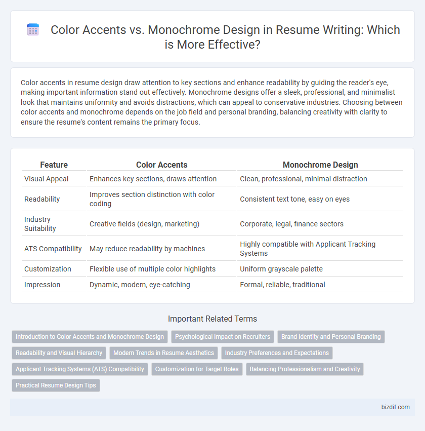
Table of Comparison
| Feature | Color Accents | Monochrome Design |
|---|---|---|
| Visual Appeal | Enhances key sections, draws attention | Clean, professional, minimal distraction |
| Readability | Improves section distinction with color coding | Consistent text tone, easy on eyes |
| Industry Suitability | Creative fields (design, marketing) | Corporate, legal, finance sectors |
| ATS Compatibility | May reduce readability by machines | Highly compatible with Applicant Tracking Systems |
| Customization | Flexible use of multiple color highlights | Uniform grayscale palette |
| Impression | Dynamic, modern, eye-catching | Formal, reliable, traditional |
Introduction to Color Accents and Monochrome Design
Color accents in resume design strategically highlight key information such as section headers and contact details, enhancing readability and guiding the recruiter's attention to critical areas. Monochrome design relies on varying shades of a single color, creating a clean, professional appearance that emphasizes content clarity without visual distractions. Selecting between color accents and monochrome design depends on industry standards and personal branding goals to effectively communicate professionalism and creativity.
Psychological Impact on Recruiters
Color accents in resume design can strategically highlight key information and evoke emotions such as enthusiasm and creativity, positively influencing recruiters' attention and perception. Monochrome designs, often seen as professional and clean, convey seriousness and reliability but may lack visual engagement. Understanding the psychological impact of color choices helps tailor resumes to align with industry expectations and recruiter preferences, enhancing the chances of making a memorable impression.
Brand Identity and Personal Branding
Color accents in resume design enhance brand identity by drawing attention to key elements, reflecting personality and professionalism through strategic use of color psychology. Monochrome design offers a clean, minimalist aesthetic that emphasizes content clarity and conveys sophistication, aligning with personal branding focused on simplicity and elegance. Choosing between color accents and monochrome should align with the individual's industry standards and personal brand message to create a cohesive and impactful resume.
Readability and Visual Hierarchy
Color accents in resume design enhance readability by creating clear visual hierarchy, guiding the reader's eye to key sections such as headings, skills, and achievements. Monochrome designs emphasize simplicity and cohesion but risk blending important information if contrast is insufficient, potentially diminishing quick scanning efficiency. Effective resumes balance color accents to highlight critical data points while maintaining legibility and professional aesthetics.
Modern Trends in Resume Aesthetics
Color accents in resume design strategically highlight key sections, enhancing readability and capturing recruiters' attention in competitive job markets. Monochrome designs offer a clean, professional aesthetic that emphasizes content clarity and minimalist elegance, aligning with modern trends favoring simplicity. Contemporary resume aesthetics balance bold color accents with monochrome elements to create visually appealing layouts that improve information hierarchy and user experience.
Industry Preferences and Expectations
Industry preferences in resume design often favor color accents for creative fields like marketing, design, and media, where visual appeal and personality are valued. Corporate sectors such as finance, law, and consulting typically prefer monochrome designs, emphasizing professionalism, clarity, and straightforward presentation of qualifications. Incorporating subtle color accents strategically can enhance readability and highlight key sections without compromising the formal tone expected in conservative industries.
Applicant Tracking Systems (ATS) Compatibility
Color accents in resume design can enhance visual appeal but may pose challenges for Applicant Tracking Systems (ATS) that often struggle to parse colored text accurately. Monochrome designs, typically in black and white, ensure optimal ATS compatibility by maintaining simple formatting and clear text recognition. Prioritizing ATS-friendly layouts without excessive color complexity improves the likelihood of resumes passing initial automated screening filters.
Customization for Target Roles
Color accents in resumes enhance customization by highlighting key skills and achievements that align with specific target roles, improving visual emphasis and recruiter engagement. Monochrome design offers a clean, professional look suitable for conservative industries but may limit the ability to direct attention to role-specific qualifications. Tailoring color use strategically ensures the resume stands out while maintaining clarity and relevance to the job description.
Balancing Professionalism and Creativity
Color accents in resume design highlight key sections and enhance visual appeal while maintaining professionalism, appealing to creative industries. Monochrome designs emphasize clarity and simplicity, favoring traditional sectors that value a straightforward presentation. Balancing creativity with professionalism involves selecting subtle color accents that draw attention without overwhelming the resume's content or readability.
Practical Resume Design Tips
Color accents in resume design highlight key sections and draw attention to important information, improving readability and visual hierarchy. Monochrome designs provide a clean, professional look that ensures content remains the focus without distractions. Choose color accents sparingly for emphasis while maintaining a balanced layout to enhance practical resume effectiveness.
Color accents vs Monochrome design Infographic