Choosing professional fonts like Arial, Calibri, or Times New Roman ensures your resume appears polished and easy to read, making a strong impression on hiring managers. Decorative fonts can be distracting and reduce readability, potentially overshadowing your qualifications. Prioritizing clean, classic fonts enhances clarity and supports a professional presentation tailored for job applications.
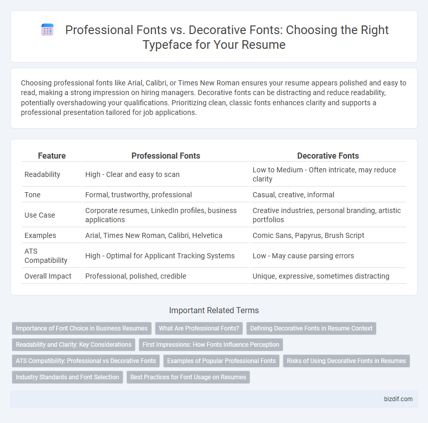
Table of Comparison
| Feature | Professional Fonts | Decorative Fonts |
|---|---|---|
| Readability | High - Clear and easy to scan | Low to Medium - Often intricate, may reduce clarity |
| Tone | Formal, trustworthy, professional | Casual, creative, informal |
| Use Case | Corporate resumes, LinkedIn profiles, business applications | Creative industries, personal branding, artistic portfolios |
| Examples | Arial, Times New Roman, Calibri, Helvetica | Comic Sans, Papyrus, Brush Script |
| ATS Compatibility | High - Optimal for Applicant Tracking Systems | Low - May cause parsing errors |
| Overall Impact | Professional, polished, credible | Unique, expressive, sometimes distracting |
Importance of Font Choice in Business Resumes
Choosing professional fonts such as Arial, Calibri, or Times New Roman ensures clarity and readability, which are critical for business resumes. Decorative fonts can distract hiring managers and reduce the perceived professionalism of the document. The right font choice enhances the overall presentation, making key information easy to scan and increasing the chances of a successful interview.
What Are Professional Fonts?
Professional fonts in resume writing are clean, easy-to-read typefaces that convey clarity and formality, such as Arial, Calibri, and Times New Roman. These fonts enhance readability and create a polished, professional appearance that appeals to recruiters and hiring managers. Using professional fonts helps ensure the resume content is taken seriously and improves overall first impressions in the job application process.
Defining Decorative Fonts in Resume Context
Decorative fonts in resume writing are typefaces designed with unique, artistic elements that prioritize visual flair over readability, often including elaborate shapes, flourishes, or non-standard letterforms. These fonts can detract from a resume's professional appearance by reducing clarity and making content difficult to skim, which may hinder an applicant's chances during initial screenings. Choosing a decorative font risks overshadowing key qualifications and creates inconsistency with industry standards, making it less suitable compared to professional fonts like Arial or Times New Roman.
Readability and Clarity: Key Considerations
Professional fonts such as Arial, Calibri, and Times New Roman enhance readability and clarity, making it easier for hiring managers to quickly scan resume content. Decorative fonts, while visually unique, often compromise legibility and can distract from the key information presented. Prioritizing clean, simple typefaces ensures your resume communicates qualifications effectively and maintains a polished, professional appearance.
First Impressions: How Fonts Influence Perception
Professional fonts like Arial, Calibri, and Times New Roman create a clean, polished appearance that conveys reliability and competence in resumes. Decorative fonts, while visually engaging, can distract hiring managers and undermine the professionalism of the application. First impressions hinge on readability and tone, making font choice crucial for influencing positive perception and increasing interview opportunities.
ATS Compatibility: Professional vs Decorative Fonts
Professional fonts such as Arial, Calibri, and Times New Roman are highly compatible with Applicant Tracking Systems (ATS), ensuring that resumes are accurately parsed and information is correctly extracted. Decorative fonts often cause misinterpretation or omission of critical data during ATS scanning due to their intricate designs and non-standard character shapes. Using professional fonts enhances readability and increases the likelihood of passing initial automated screening processes.
Examples of Popular Professional Fonts
Professional fonts such as Arial, Calibri, Times New Roman, and Helvetica are widely preferred in resume writing for their clarity, readability, and formal appearance. These fonts ensure that the content is easily scanned by applicant tracking systems (ATS) and hiring managers, enhancing the chances of positive evaluation. Unlike decorative fonts like Comic Sans or Papyrus, which can appear unprofessional and distract from the resume's content, popular professional fonts maintain a clean and polished look suitable for diverse industries.
Risks of Using Decorative Fonts in Resumes
Using decorative fonts in resumes can undermine professionalism and readability, increasing the risk of a negative impression on recruiters. These fonts often distract from key information and may be incompatible with applicant tracking systems (ATS), causing formatting errors or misinterpretation of content. Sticking to professional fonts like Calibri, Arial, or Times New Roman ensures clarity and maintains the resume's credibility.
Industry Standards and Font Selection
Professional fonts such as Arial, Times New Roman, and Calibri dominate industry standards for resume writing due to their clarity and readability across applicant tracking systems (ATS). Decorative fonts, while visually distinctive, are often discouraged because they can reduce legibility and hinder automated resume parsing, impacting candidate evaluation. Selecting a clean, widely accepted typeface ensures optimal presentation and compliance with employer expectations in competitive job markets.
Best Practices for Font Usage on Resumes
Professional fonts such as Arial, Calibri, and Times New Roman ensure clarity and readability on resumes, making it easier for recruiters to scan information quickly. Decorative fonts should be avoided as they can appear unprofessional and may distract from the resume's content, potentially hindering recruiter engagement. Optimal font size ranges from 10 to 12 points, balancing legibility with efficient use of space on the page.
Professional fonts vs Decorative fonts Infographic