Traditional fonts such as Times New Roman and Arial convey professionalism and readability, making them ideal for formal resumes in conservative industries. Creative fonts like Calibri and Helvetica can add personality and modernity, helping candidates stand out in creative fields. Balancing font choice with clarity ensures that the resume remains both visually appealing and easy to read.
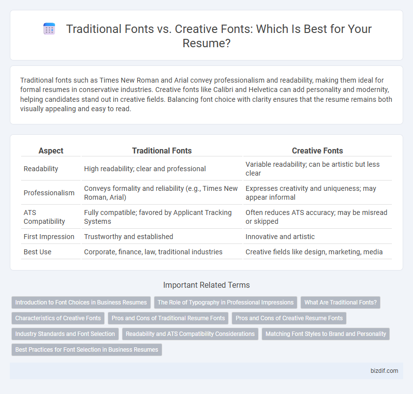
Table of Comparison
| Aspect | Traditional Fonts | Creative Fonts |
|---|---|---|
| Readability | High readability; clear and professional | Variable readability; can be artistic but less clear |
| Professionalism | Conveys formality and reliability (e.g., Times New Roman, Arial) | Expresses creativity and uniqueness; may appear informal |
| ATS Compatibility | Fully compatible; favored by Applicant Tracking Systems | Often reduces ATS accuracy; may be misread or skipped |
| First Impression | Trustworthy and established | Innovative and artistic |
| Best Use | Corporate, finance, law, traditional industries | Creative fields like design, marketing, media |
Introduction to Font Choices in Business Resumes
Traditional fonts such as Times New Roman, Arial, and Calibri are preferred in business resumes for their clarity, professionalism, and ease of reading by applicant tracking systems (ATS). Creative fonts like scripts or decorative styles may express individuality but risk appearing unprofessional or causing readability issues, potentially harming interview prospects. Selecting fonts that balance aesthetic appeal with conventional standards ensures resumes are both visually engaging and favorably received by hiring managers.
The Role of Typography in Professional Impressions
Traditional fonts like Times New Roman and Arial convey professionalism and reliability, making them ideal for formal industries such as law and finance. Creative fonts can showcase individuality and creativity, useful for design or marketing roles but risk appearing unprofessional if overused. Typography choice directly influences readability and first impressions, affecting a candidate's perceived competence and attention to detail.
What Are Traditional Fonts?
Traditional fonts, such as Times New Roman, Garamond, and Georgia, are serif typefaces known for their classic, professional appearance, widely used in formal documents and resumes. These fonts enhance readability and convey a sense of reliability and competence, making them ideal for conservative industries like law, finance, and education. Choosing a traditional font ensures that your resume maintains a polished, timeless look that appeals to hiring managers seeking clarity and professionalism.
Characteristics of Creative Fonts
Creative fonts in resume writing feature unique shapes, varying line weights, and artistic flair that capture attention and showcase individuality. These fonts often include handwritten styles, decorative elements, and unconventional letterforms that emphasize personality and creativity. Their distinctiveness can enhance visual appeal but should be balanced with readability to maintain professionalism.
Pros and Cons of Traditional Resume Fonts
Traditional resume fonts like Times New Roman, Arial, and Calibri offer clarity and professionalism, ensuring readability across applicant tracking systems (ATS) and hiring managers. Their conservative style enhances credibility and maintains a formal tone, which is favored in corporate, legal, and financial industries. However, overly common fonts may appear generic, potentially diminishing uniqueness and failing to capture attention in creative job markets.
Pros and Cons of Creative Resume Fonts
Creative resume fonts enhance visual appeal and help candidates stand out, making a strong first impression on hiring managers. However, they may compromise readability and appear unprofessional in conservative industries, potentially hindering the resume's effectiveness. Balancing creativity with clarity is essential to ensure the resume remains both attractive and easy to read.
Industry Standards and Font Selection
Selecting traditional fonts like Times New Roman or Arial aligns with industry standards for resume writing, ensuring readability and professionalism across sectors such as finance, law, and healthcare. Creative fonts, while visually appealing, risk undermining clarity and may not pass through Applicant Tracking Systems (ATS) effectively, potentially reducing the chance of a resume being noticed. Prioritizing font choices that balance uniqueness with conventional legibility enhances both human and digital resume screenings.
Readability and ATS Compatibility Considerations
Traditional fonts like Arial, Times New Roman, and Calibri ensure high readability and optimal compatibility with Applicant Tracking Systems (ATS), making them the preferred choice for resume writing. Creative fonts such as Script or Decorative styles can hinder ATS parsing and reduce readability, increasing the risk of resume rejection during automated screening. Prioritizing clean, professional fonts enhances keyword recognition and improves the chances of passing initial applicant screening processes.
Matching Font Styles to Brand and Personality
Traditional fonts like Times New Roman and Garamond convey professionalism and reliability, making them ideal for conservative industries such as law and finance. Creative fonts such as Montserrat or Pacifico reflect individuality and innovation, aligning well with brands in creative fields like marketing or design. Selecting a font style that matches the brand and personal personality enhances resume readability and leaves a lasting impression on potential employers.
Best Practices for Font Selection in Business Resumes
Choosing traditional fonts like Times New Roman, Arial, or Calibri ensures clarity and professionalism in business resumes, enhancing readability for hiring managers and applicant tracking systems. Creative fonts may undermine the formal tone, risking misinterpretation or rejection in conservative industries. Best practices recommend maintaining font sizes between 10 and 12 points with consistent style to convey competence and attention to detail effectively.
Traditional Fonts vs Creative Fonts Infographic