 bizdif.com
 Mobile-first design prioritizes creating a seamless user experience by designing specifically for smaller screens before scaling up to larger devices, ensuring optimal performance and usability on smartphones. Responsive design adapts the layout fluidly across all screen sizes but may start with desktop as the baseline, potentially leading to compromises in mobile usability. In e-commerce, mobile-first design often results in faster load times and higher conversion rates due to its focus on mobile user behavior and constraints.
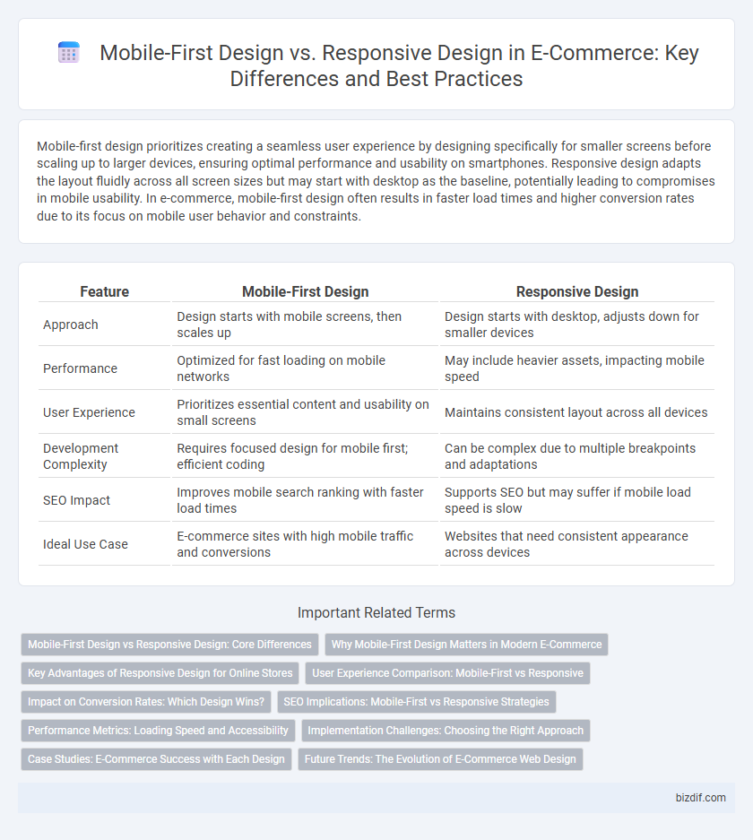
Table of Comparison
| Feature | Mobile-First Design | Responsive Design |
|---|---|---|
| Approach | Design starts with mobile screens, then scales up | Design starts with desktop, adjusts down for smaller devices |
| Performance | Optimized for fast loading on mobile networks | May include heavier assets, impacting mobile speed |
| User Experience | Prioritizes essential content and usability on small screens | Maintains consistent layout across all devices |
| Development Complexity | Requires focused design for mobile first; efficient coding | Can be complex due to multiple breakpoints and adaptations |
| SEO Impact | Improves mobile search ranking with faster load times | Supports SEO but may suffer if mobile load speed is slow |
| Ideal Use Case | E-commerce sites with high mobile traffic and conversions | Websites that need consistent appearance across devices |
Mobile-First Design vs Responsive Design: Core Differences
Mobile-First Design prioritizes creating layouts specifically tailored for smaller screens before scaling up to larger devices, ensuring optimal performance and user experience on mobile platforms. Responsive Design, in contrast, employs flexible grids and media queries to adapt a single design across multiple screen sizes without prioritizing any specific device. The core difference lies in Mobile-First Design's emphasis on mobile usability from the start, whereas Responsive Design focuses on fluid adaptability across all devices.
Why Mobile-First Design Matters in Modern E-Commerce
Mobile-first design prioritizes seamless user experiences on smartphones, catering to the majority of e-commerce traffic originating from mobile devices. This approach enhances page load speed, improves navigation, and boosts conversion rates by optimizing for smaller screens before scaling up to desktops. Responsive design adapts to various screen sizes but often starts with desktop layouts, potentially compromising mobile performance critical for driving mobile commerce revenue.
Key Advantages of Responsive Design for Online Stores
Responsive design offers online stores seamless adaptability across diverse devices, ensuring consistent user experience and reducing bounce rates. It enhances SEO performance by enabling a single URL for all device types, which simplifies indexing and improves search rankings. Moreover, responsive design streamlines maintenance and updates, lowering development costs while increasing overall site speed and accessibility.
User Experience Comparison: Mobile-First vs Responsive
Mobile-first design prioritizes the mobile user experience by designing for smaller screens first, ensuring faster load times, simplified navigation, and touch-friendly interfaces that enhance usability on smartphones and tablets. Responsive design adapts the layout to various screen sizes but often starts with a desktop perspective, which can lead to less optimized mobile performance and slower interactions. E-commerce sites using mobile-first design report higher engagement and conversion rates on mobile devices compared to those relying solely on responsive design.
Impact on Conversion Rates: Which Design Wins?
Mobile-first design significantly boosts e-commerce conversion rates by prioritizing fast loading times, intuitive navigation, and streamlined checkout processes tailored for small screens. Responsive design ensures a consistent user experience across devices, but may sacrifice speed and usability on mobile, potentially lowering conversion rates. Data reveals that mobile-first optimized stores see up to 30% higher conversion rates compared to those solely relying on responsive design frameworks.
SEO Implications: Mobile-First vs Responsive Strategies
Mobile-first design prioritizes optimizing the user experience for mobile devices, which aligns with Google's mobile-first indexing, enhancing search engine rankings by ensuring fast loading times and seamless navigation on smartphones. Responsive design adapts the layout to different screen sizes but may not always prioritize mobile speed and usability, potentially impacting SEO performance. Implementing mobile-first strategies improves crawlability, reduces bounce rates, and boosts organic traffic compared to traditional responsive designs.
Performance Metrics: Loading Speed and Accessibility
Mobile-first design significantly enhances loading speed by prioritizing essential content and reducing resource-heavy elements, which improves overall website performance on mobile devices. Responsive design adapts layouts to various screen sizes but may include unnecessary desktop assets that slow down loading times, impacting user experience and accessibility. Optimizing for mobile-first strategies results in faster load times and better accessibility compliance, crucial for boosting e-commerce conversions and meeting diverse user needs.
Implementation Challenges: Choosing the Right Approach
Mobile-first design requires prioritizing content and features for smaller screens, demanding careful planning and resource allocation during development. Responsive design, while flexible across devices, often involves complex CSS and longer testing cycles to ensure performance and usability on diverse screen sizes. Selecting the right approach depends on the target audience's device usage patterns, development budget, and long-term scalability goals for the e-commerce platform.
Case Studies: E-Commerce Success with Each Design
Mobile-first design has driven a 30% increase in conversion rates for e-commerce giants like ASOS by prioritizing fast load times and seamless navigation on smartphones. Responsive design enabled brands such as Walmart to deliver consistent user experiences across all devices, resulting in a 25% boost in average order value. Case studies highlight mobile-first's effectiveness in optimizing for mobile traffic, while responsive design excels in cross-device accessibility, both crucial for e-commerce growth.
Future Trends: The Evolution of E-Commerce Web Design
Mobile-first design prioritizes optimizing e-commerce websites for smartphones, ensuring faster loading times and seamless user experiences as mobile traffic continues to dominate global internet usage. Responsive design remains essential by adapting layouts fluidly across various devices, but future trends emphasize progressive web apps (PWAs) and AI-driven personalization integrated within mobile-first frameworks. Enhanced mobile-first strategies combined with responsive adaptability will drive the evolution of e-commerce web design, improving conversion rates and supporting omnichannel retail growth.
Mobile-First Design vs Responsive Design Infographic