Color psychology in interior design influences emotions and moods through hues, shaping spaces to feel calming, energizing, or cozy. Material psychology impacts tactile perception and comfort, where textures like smooth wood or rough stone evoke different sensory and emotional responses. Balancing color and material choices creates environments that harmonize aesthetic appeal with psychological well-being.
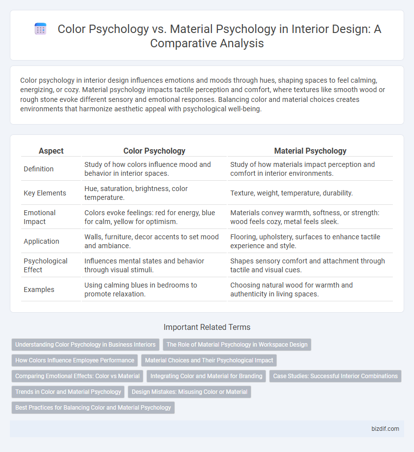
Table of Comparison
| Aspect | Color Psychology | Material Psychology |
|---|---|---|
| Definition | Study of how colors influence mood and behavior in interior spaces. | Study of how materials impact perception and comfort in interior environments. |
| Key Elements | Hue, saturation, brightness, color temperature. | Texture, weight, temperature, durability. |
| Emotional Impact | Colors evoke feelings: red for energy, blue for calm, yellow for optimism. | Materials convey warmth, softness, or strength: wood feels cozy, metal feels sleek. |
| Application | Walls, furniture, decor accents to set mood and ambiance. | Flooring, upholstery, surfaces to enhance tactile experience and style. |
| Psychological Effect | Influences mental states and behavior through visual stimuli. | Shapes sensory comfort and attachment through tactile and visual cues. |
| Examples | Using calming blues in bedrooms to promote relaxation. | Choosing natural wood for warmth and authenticity in living spaces. |
Understanding Color Psychology in Business Interiors
Understanding color psychology in business interiors enhances employee productivity and influences customer perception by strategically selecting hues that evoke desired emotions. Warm colors like red and orange stimulate energy and creativity, while cool colors such as blue and green promote calmness and focus, directly impacting workplace ambiance. Material psychology complements this by adding texture and sensory experiences that reinforce the psychological effects of color, creating a cohesive and motivating environment.
The Role of Material Psychology in Workspace Design
Material psychology significantly influences workspace design by affecting employee comfort, productivity, and overall well-being through tactile and sensory experiences. Natural materials like wood and stone create warmth and reduce stress, while synthetic surfaces can promote cleanliness and modernity, shaping emotional responses and cognitive function. Balancing material choices with color psychology enhances an environment that fosters creativity, focus, and satisfaction in professional settings.
How Colors Influence Employee Performance
Colors in the workplace significantly impact employee performance by affecting mood, focus, and energy levels; for example, blue hues promote calmness and concentration, while red stimulates energy and attention to detail. Material psychology complements this by influencing tactile and visual experiences, where transparent glass fosters openness, and textured wood evokes warmth and comfort. Strategic integration of color and materials enhances productivity and well-being through a balanced sensory environment.
Material Choices and Their Psychological Impact
Material choices in interior design significantly influence psychological responses, with natural materials like wood and stone fostering warmth, comfort, and a grounded atmosphere, while synthetic materials often evoke modernity and cleanliness. Textures and finishes also impact mood; smooth, polished surfaces tend to create a sense of sophistication and calm, whereas rough, tactile materials can stimulate energy and creativity. Understanding the psychological effects of materials alongside color psychology enhances purposeful space design that supports emotional well-being and functional intent.
Comparing Emotional Effects: Color vs Material
Color psychology influences emotions through hues that evoke feelings like calmness from blues or energy from reds, directly impacting mood and perception in interior spaces. Material psychology affects tactile and sensory experiences, where textures like soft fabrics induce comfort and rough surfaces create a sense of ruggedness or authenticity. Comparing emotional effects, color primarily shapes immediate emotional responses, while materials contribute to sustained sensory comfort and psychological attachment in interior design.
Integrating Color and Material for Branding
Integrating color and material in interior design strategically enhances brand identity by evoking targeted emotions and sensory experiences. Color psychology manipulates hues to influence mood and perception, while material psychology employs textures and finishes that convey quality and values. Combining vibrant colors with tactile materials creates a cohesive environment that reinforces brand messaging and customer engagement.
Case Studies: Successful Interior Combinations
Case studies reveal that color psychology influences mood and perception, while material psychology impacts tactile experience and spatial functionality in interior design. Successful interior combinations, such as using warm hues paired with natural wood, enhance comfort and evoke relaxation, demonstrated in hospitality spaces like boutique hotels. Research from behavioral design confirms that integrating these elements strategically improves user satisfaction and engagement in both residential and commercial environments.
Trends in Color and Material Psychology
Trends in color psychology reveal a growing preference for calming hues such as soft blues and muted greens, widely used to create serene and restful interiors. Material psychology emphasizes tactile experiences, with natural textures like wood, stone, and woven fibers gaining popularity for their grounding and comforting effects. Combining these elements, contemporary interior design leverages the synergy of soothing colors and organic materials to enhance emotional well-being and foster harmonious living spaces.
Design Mistakes: Misusing Color or Material
Misusing color or material in interior design can disrupt the intended psychological impact, leading to environments that feel chaotic or uncomfortable. Overusing bright colors may cause overstimulation, while selecting materials that clash with the space's purpose, like cold metals in cozy living areas, can create a sense of discord. Understanding the emotional responses elicited by both color psychology and material choices ensures harmonious and functional interior spaces.
Best Practices for Balancing Color and Material Psychology
Balancing color psychology and material psychology in interior design enhances emotional response and spatial harmony by thoughtfully combining hues with textures. Use warm colors like reds and oranges alongside tactile materials such as wood or leather to evoke comfort and energy, while cool tones paired with smooth surfaces like glass or metal promote calmness and clarity. Prioritize natural and sustainable materials with complementary color palettes to create spaces that are both aesthetically pleasing and psychologically nurturing.
color psychology vs material psychology Infographic