Material palettes in interior design prioritize texture, durability, and natural qualities that enhance the tactile and visual experience of a space, especially important in pet-friendly environments where surfaces must withstand wear and tear. Color palettes focus on hues that create mood and harmony, balancing aesthetics with practical considerations like hiding pet hair and stains. Combining both palettes thoughtfully ensures a cohesive design that is both functional and visually appealing for pet owners.
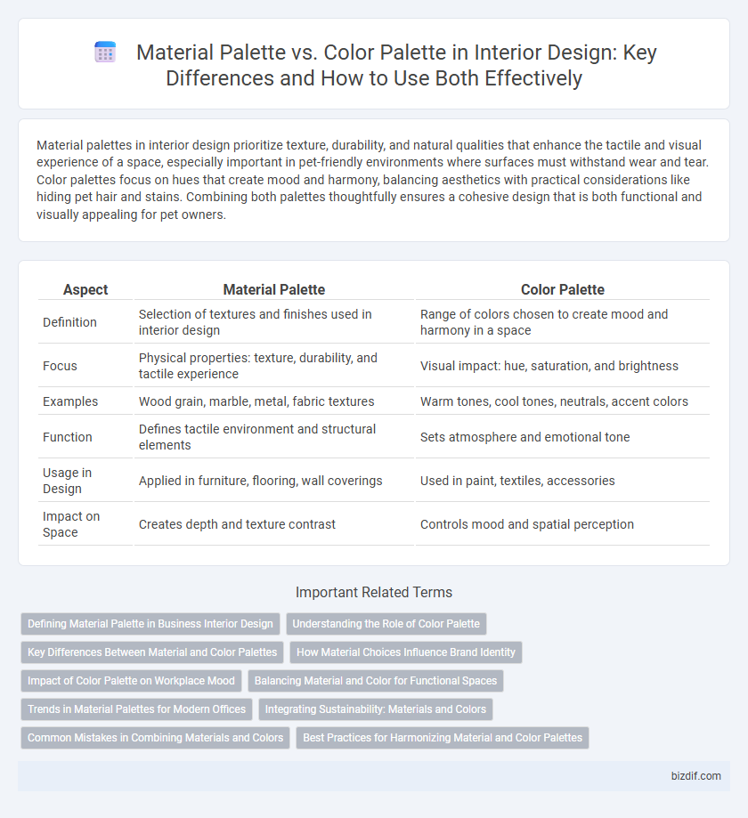
Table of Comparison
| Aspect | Material Palette | Color Palette |
|---|---|---|
| Definition | Selection of textures and finishes used in interior design | Range of colors chosen to create mood and harmony in a space |
| Focus | Physical properties: texture, durability, and tactile experience | Visual impact: hue, saturation, and brightness |
| Examples | Wood grain, marble, metal, fabric textures | Warm tones, cool tones, neutrals, accent colors |
| Function | Defines tactile environment and structural elements | Sets atmosphere and emotional tone |
| Usage in Design | Applied in furniture, flooring, wall coverings | Used in paint, textiles, accessories |
| Impact on Space | Creates depth and texture contrast | Controls mood and spatial perception |
Defining Material Palette in Business Interior Design
The material palette in business interior design encompasses the selection of textures, finishes, and materials that define the tactile and aesthetic quality of a space, such as wood, metal, glass, and fabric. It directly influences durability, maintenance, and the overall atmosphere tailored to the brand identity and functionality of the workspace. Unlike the color palette, which focuses on chromatic choices, the material palette integrates physical properties that enhance spatial experience and operational efficiency.
Understanding the Role of Color Palette
The color palette in interior design serves as the foundation for creating mood, harmony, and visual interest, directly influencing the emotional response within a space. Unlike the material palette, which focuses on texture and tactile quality, the color palette strategically balances hues to enhance lighting, spatial perception, and thematic consistency. Mastery of the color palette enables designers to seamlessly integrate materials, ensuring cohesive and immersive environments tailored to function and style.
Key Differences Between Material and Color Palettes
Material palettes focus on textures, finishes, and tactile qualities such as wood grain, metal, stone, and fabric types, influencing the spatial experience and functionality. Color palettes prioritize hues, tones, and saturation levels that set the mood and visual harmony within a space. The key difference lies in material palettes shaping physical interaction and durability, while color palettes primarily affect aesthetic perception and emotional impact.
How Material Choices Influence Brand Identity
Material choices profoundly influence brand identity by conveying texture, quality, and emotional resonance that color palettes alone cannot achieve. Natural wood, polished metals, and plush textiles each evoke distinct brand attributes, from warmth and authenticity to modernity and luxury. Integrating a carefully curated material palette ensures a cohesive sensory experience that reinforces a brand's unique personality and customer perception.
Impact of Color Palette on Workplace Mood
Color palette choices significantly influence workplace mood by affecting emotions and productivity; warm tones like reds and oranges stimulate energy, while cool tones such as blues and greens promote calm and focus. Selecting a harmonious color palette tailored to the desired atmosphere enhances employee well-being and creativity. Unlike material palettes that emphasize texture and durability, color palettes directly shape the psychological environment of workspaces.
Balancing Material and Color for Functional Spaces
Balancing material and color palettes is essential for creating functional interior spaces that are both visually appealing and practical. Combining durable materials like hardwood or stone with complementary color palettes enhances spatial harmony while addressing wear and maintenance needs. Strategic integration of textures and hues supports mood setting and optimizes usability in living, working, or recreational environments.
Trends in Material Palettes for Modern Offices
Material palettes for modern offices emphasize sustainable, textured surfaces such as reclaimed wood, matte metals, and natural stone to create an eco-friendly and tactile environment. Innovations in composite materials and smart glass enhance functionality while maintaining aesthetic appeal, aligning with biophilic design principles. Trending colors in material palettes often include muted earth tones and soft neutrals, complementing the natural textures and promoting a calm, productive workplace atmosphere.
Integrating Sustainability: Materials and Colors
A well-curated material palette emphasizes sustainable resources such as reclaimed wood, bamboo, and low-VOC finishes, reducing environmental impact while enhancing indoor air quality. The color palette complements this approach by utilizing natural, earth-inspired tones that require fewer synthetic dyes and minimize chemical treatments. Integrating sustainability through both materials and colors fosters eco-friendly interiors that promote health and long-term environmental stewardship.
Common Mistakes in Combining Materials and Colors
Common mistakes in combining material palettes and color palettes often include neglecting the tactile and visual contrast needed to create balance and cohesion in interior design. Overusing similar textures or colors can lead to a monotonous and flat aesthetic, while clashing or overly saturated hues may disrupt harmony within the space. Successful combinations thoughtfully pair materials like wood, metal, and fabric with complementary or contrasting colors to enhance depth and interest.
Best Practices for Harmonizing Material and Color Palettes
Selecting a cohesive material palette alongside a complementary color palette enhances spatial harmony and visual balance in interior design. Prioritize natural textures such as wood, stone, and metal paired with analogous or neutral colors to create depth without overwhelming the senses. Incorporate repetition of key hues across textiles, finishes, and furnishings to unify the aesthetic while allowing materials to add tactile richness.
Material palette vs color palette Infographic