Infographics combine text, images, and data to tell a visual story, making complex information easily understandable. Data visualization focuses on representing data through charts, graphs, and maps to reveal patterns and insights. Both play crucial roles in graphic design by enhancing communication and engagement.
Table of Comparison
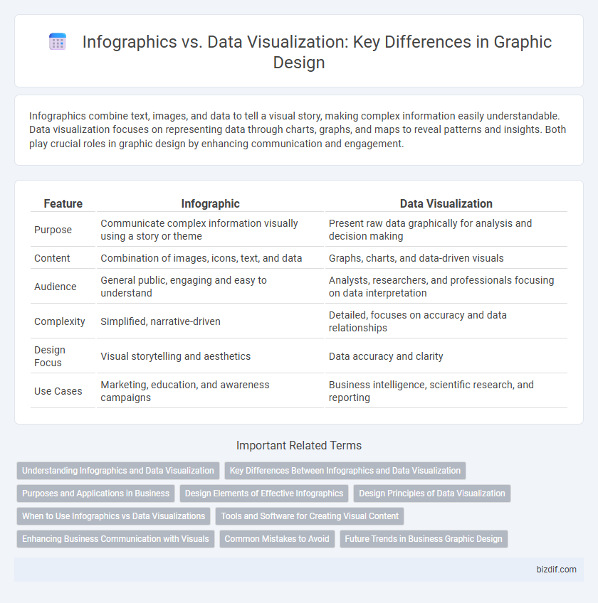
| Feature | Infographic | Data Visualization |
|---|---|---|
| Purpose | Communicate complex information visually using a story or theme | Present raw data graphically for analysis and decision making |
| Content | Combination of images, icons, text, and data | Graphs, charts, and data-driven visuals |
| Audience | General public, engaging and easy to understand | Analysts, researchers, and professionals focusing on data interpretation |
| Complexity | Simplified, narrative-driven | Detailed, focuses on accuracy and data relationships |
| Design Focus | Visual storytelling and aesthetics | Data accuracy and clarity |
| Use Cases | Marketing, education, and awareness campaigns | Business intelligence, scientific research, and reporting |
Understanding Infographics and Data Visualization
Infographics combine visual elements and concise text to present complex information clearly, enhancing audience comprehension through storytelling and design. Data visualization uses charts, graphs, and maps to represent raw data for quick analysis and pattern recognition, emphasizing accuracy and scalability. Both techniques improve communication but serve different purposes: infographics simplify and engage, while data visualization supports detailed data interpretation.
Key Differences Between Infographics and Data Visualization
Infographics combine text, images, and data to create a visually appealing and easily digestible story, often designed for quick understanding and engagement. Data visualization strictly focuses on representing complex datasets through charts, graphs, and maps to facilitate detailed analysis and pattern recognition. The key difference lies in infographics prioritizing narrative and aesthetic appeal, while data visualization emphasizes analytical clarity and accuracy.
Purposes and Applications in Business
Infographics simplify complex information into visually engaging formats to enhance brand storytelling and marketing campaigns, making data easily digestible for broader audiences. Data visualization uses interactive charts and graphs to analyze trends, performance metrics, and customer insights for informed decision-making in finance, sales, and operations. Businesses leverage infographics for content marketing and education, while data visualization supports strategic planning and real-time data monitoring.
Design Elements of Effective Infographics
Effective infographics utilize a balanced combination of color schemes, typography, and iconography to enhance visual appeal and readability. Clear hierarchy through size variations and alignment guides the viewer's eye, while data accuracy and simplicity prevent information overload. These design elements collectively transform complex data into engaging, easily digestible narratives.
Design Principles of Data Visualization
Data visualization emphasizes clarity and accuracy, using principles such as appropriate scale, clear labeling, and consistent color schemes to ensure data is easily interpretable. Effective design minimizes clutter and highlights key trends, leveraging visual hierarchy and Gestalt principles to direct viewer attention. Unlike infographics, which combine storytelling elements and illustrative graphics, data visualization strictly prioritizes the precise representation of quantitative information for analytical insight.
When to Use Infographics vs Data Visualizations
Infographics are ideal for presenting complex information or storytelling by combining text, visuals, and data to engage a broad audience. Data visualizations excel at displaying raw data patterns, trends, or relationships, making them essential for analytical and decision-making purposes. Use infographics when the goal is to simplify and communicate insights clearly, while data visualizations should be chosen for in-depth data analysis and exploration.
Tools and Software for Creating Visual Content
Infographic creation tools like Canva and Piktochart offer user-friendly templates and drag-and-drop features tailored for storytelling with visuals. In contrast, data visualization software such as Tableau and Power BI prioritize analytical capabilities, enabling dynamic charting and real-time data integration. Choosing between these tools depends on whether the goal is visual storytelling or deep data analysis.
Enhancing Business Communication with Visuals
Infographics combine graphics, text, and data to present complex information clearly, making them ideal for marketing and brand storytelling. Data visualization uses charts, graphs, and maps to analyze and interpret large datasets, supporting data-driven decision-making. Both tools enhance business communication by transforming abstract data into compelling visual narratives that improve comprehension and engagement.
Common Mistakes to Avoid
Common mistakes in infographic design include overcrowding visuals with excessive information, leading to cognitive overload and reduced clarity. In data visualization, a frequent error is misrepresenting data through inappropriate chart types or distorted scales, which can mislead interpretation. Both fields require careful balance between aesthetic appeal and accurate, concise data presentation to effectively communicate insights.
Future Trends in Business Graphic Design
Future trends in business graphic design emphasize the integration of interactive infographics and advanced data visualization techniques powered by AI and machine learning algorithms. Enhanced user engagement is achieved through dynamic visual storytelling that combines real-time data analytics with intuitive design elements. Businesses leverage these innovations to improve decision-making processes and communication efficiency across digital platforms.
Infographic vs Data visualization Infographic