White space and negative space both refer to the empty areas in graphic design, but white space specifically denotes the intentional blank areas around elements that improve readability and balance. Negative space involves using the empty areas creatively to form shapes or symbols, adding hidden meaning or enhancing visual interest. Mastering the distinction between white space and negative space can significantly elevate a design's clarity and aesthetic appeal.
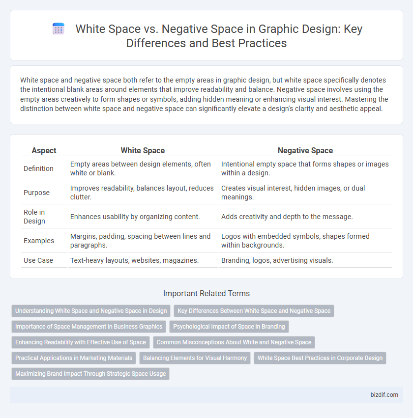
Table of Comparison
| Aspect | White Space | Negative Space |
|---|---|---|
| Definition | Empty areas between design elements, often white or blank. | Intentional empty space that forms shapes or images within a design. |
| Purpose | Improves readability, balances layout, reduces clutter. | Creates visual interest, hidden images, or dual meanings. |
| Role in Design | Enhances usability by organizing content. | Adds creativity and depth to the message. |
| Examples | Margins, padding, spacing between lines and paragraphs. | Logos with embedded symbols, shapes formed within backgrounds. |
| Use Case | Text-heavy layouts, websites, magazines. | Branding, logos, advertising visuals. |
Understanding White Space and Negative Space in Design
White space in graphic design refers to the unmarked areas surrounding visual elements, enhancing readability and overall composition by providing balance and breathing room. Negative space, a subset of white space, is intentionally used to create shapes or symbols within the empty areas, adding depth and meaning to the design. Mastering the distinction between white space and negative space allows designers to craft visually appealing layouts that effectively communicate the intended message.
Key Differences Between White Space and Negative Space
White space refers to the unmarked areas between design elements, used intentionally to create breathing room and improve readability, while negative space specifically shapes and defines the subject by utilizing the empty spaces around and within objects. White space often appears as margins, padding, or gutters that balance content, whereas negative space plays a more active role in visual storytelling by forming secondary images or outlines. Understanding these key differences enhances layout clarity, emphasizing hierarchy in graphic design.
Importance of Space Management in Business Graphics
Effective space management in business graphics enhances visual hierarchy, improves readability, and directs viewer attention to key elements, boosting overall brand communication. White space, often referred to as negative space, is deliberately used to create balance and prevent clutter, ensuring designs convey messages clearly and professionally. Optimizing the use of space contributes to stronger customer engagement and more memorable visual identities, essential for competitive market positioning.
Psychological Impact of Space in Branding
White space, often referred to as negative space, plays a crucial role in shaping the psychological impact of branding by enhancing clarity and evoking a sense of elegance and sophistication. Strategic use of white space directs focus to key brand elements, increasing visual hierarchy and improving user engagement. Brands leveraging ample negative space convey trust, simplicity, and professionalism, which significantly influence consumer perception and emotional response.
Enhancing Readability with Effective Use of Space
Effective use of white space in graphic design significantly enhances readability by providing visual breathing room that prevents clutter and guides the viewer's eye through the content. White space, also known as negative space, strategically balances text and images, improving content hierarchy and focus without compromising visual appeal. Prioritizing generous margins and padding around key elements ensures clear separation, making designs more accessible and easier to navigate.
Common Misconceptions About White and Negative Space
White space and negative space are often mistakenly considered identical, but white space specifically refers to the empty areas created intentionally by designers, which may not always be white in color, while negative space includes any unused or background space that shapes the overall composition. Many designers confuse negative space with mere background, overlooking its critical role in defining visual balance and enhancing focal points. Understanding the distinction is essential for optimizing layout efficiency and improving user experience in graphic design projects.
Practical Applications in Marketing Materials
White space enhances readability and directs viewer focus in marketing materials by creating visual breathing room around key elements such as headlines and calls to action. Negative space cleverly forms shapes or symbols that reinforce brand identity, making logos and advertisements more memorable. Effective use of both white and negative space increases engagement and conversion rates by improving overall design clarity and aesthetic appeal.
Balancing Elements for Visual Harmony
White space and negative space both contribute to balancing elements in graphic design, enhancing visual harmony by preventing clutter and improving readability. White space refers to the intentional empty areas around and between design elements, which guide the viewer's eye and create a clean, organized layout. Negative space is the unoccupied space within or between objects that forms shapes or silhouettes, adding depth and emphasis to the overall composition.
White Space Best Practices in Corporate Design
White space, also known as negative space, plays a crucial role in corporate graphic design by enhancing readability and visual hierarchy. Effective use of white space ensures content clarity, directs user focus, and improves overall aesthetic appeal, which strengthens brand perception and communication. Prioritizing ample margins, balanced layouts, and strategic spacing around logos and text blocks optimizes white space usage for professional and impactful corporate designs.
Maximizing Brand Impact Through Strategic Space Usage
White space and negative space are essential elements in graphic design that enhance clarity and emphasize key brand messages. Strategic use of white space guides viewers' attention, improves readability, and creates a clean, sophisticated look that strengthens brand identity. Maximizing brand impact involves balancing these spaces to create visual hierarchy and memorable user experiences.
White Space vs Negative Space Infographic