Pantone matching ensures precise color consistency across various materials by using standardized ink formulas, ideal for brand-specific designs. CMYK printing relies on a combination of cyan, magenta, yellow, and black inks to produce a wide range of colors but may result in slight color variations due to ink blending. Choosing Pantone is best for exact color reproduction, while CMYK offers cost-effective flexibility for full-color prints.
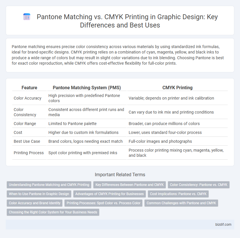
Table of Comparison
| Feature | Pantone Matching System (PMS) | CMYK Printing |
|---|---|---|
| Color Accuracy | High precision with predefined Pantone colors | Variable; depends on printer and ink calibration |
| Color Consistency | Consistent across different print runs and media | Can vary due to ink mix and printing conditions |
| Color Range | Limited to Pantone palette | Broader, can produce millions of colors |
| Cost | Higher due to custom ink formulations | Lower, uses standard four-color process |
| Best Use Case | Brand colors, logos needing exact match | Full-color images and photographs |
| Printing Process | Spot color printing with premixed inks | Process color printing mixing cyan, magenta, yellow, and black |
Understanding Pantone Matching and CMYK Printing
Pantone Matching System (PMS) uses standardized spot colors to ensure precise and consistent color reproduction across various materials, essential for brand identity and accurate color matching. CMYK printing relies on a combination of cyan, magenta, yellow, and black inks to produce a wide range of colors through layering, but it can result in color variations due to ink mixing and printing conditions. Understanding the differences between Pantone and CMYK is crucial for graphic designers to choose the appropriate color model that meets specific project requirements and maintains color fidelity.
Key Differences Between Pantone and CMYK
Pantone matching uses standardized spot colors for precise and consistent color reproduction, ideal for branding where exact color accuracy is crucial. CMYK printing relies on a four-color process (cyan, magenta, yellow, and black) to create a wide range of colors through layering, but it can result in color variations depending on the printer and materials. Pantone offers predictable, vibrant colors, while CMYK provides flexibility and cost-effective printing for full-color images and complex designs.
Color Consistency: Pantone vs. CMYK
Pantone matching ensures precise color consistency by using standardized spot colors, which maintain exact hues across different print runs and materials. CMYK printing relies on a four-color process that can result in slight color variations due to ink mixing and printer settings. Designers prefer Pantone for brand-critical colors that demand exact replication, while CMYK is often used for full-color images with acceptable color shifts.
When to Use Pantone in Graphic Design
Use Pantone colors in graphic design when precise color matching is crucial, such as in brand logos and corporate identity materials, ensuring consistency across different printing processes. Pantone provides a standardized color system that guarantees exact color reproduction, especially for spot colors that CMYK printing cannot accurately replicate. For projects requiring vibrant, solid colors or limited color palettes, Pantone inks deliver superior color fidelity and uniformity.
Advantages of CMYK Printing for Businesses
CMYK printing offers businesses the advantage of cost-effective production and consistent color output across various materials, making it ideal for large volume projects. It enables accurate color reproduction within the full-color spectrum, ensuring vibrant and professional visuals for marketing materials. The widespread compatibility of CMYK with most printing equipment streamlines the workflow, reducing turnaround times and improving efficiency.
Cost Implications: Pantone vs. CMYK
Pantone matching generally incurs higher costs than CMYK printing due to the use of custom inks and more complex setup processes required for accurate spot color reproduction. CMYK printing offers a budget-friendly alternative by using a combination of four standard inks, reducing the need for costly custom mixes and making it ideal for large-volume runs. However, the precision of Pantone colors can justify the extra expense for brands needing exact color consistency across various print materials.
Color Accuracy and Brand Identity
Pantone matching ensures precise color accuracy by using standardized pre-mixed inks, crucial for maintaining consistent brand identity across different print runs and materials. CMYK printing relies on four-color process mixing, which can cause color variations due to ink blending and printer calibration, potentially compromising brand consistency. Choosing Pantone colors guarantees exact brand colors, critical for logos and marketing materials that demand uniformity in visual representation.
Printing Processes: Spot Color vs. Process Color
Pantone matching uses spot color printing, applying pre-mixed inks to achieve precise, consistent hues ideal for brand colors and logos. CMYK printing relies on process color, blending cyan, magenta, yellow, and black inks in varying percentages to produce a wide color spectrum but may result in slight color variations. Spot color printing ensures exact color fidelity, while CMYK offers greater flexibility and cost efficiency for complex, multi-colored designs.
Common Challenges with Pantone and CMYK
Pantone matching often faces challenges such as color inconsistency due to variations in ink formulation and substrate absorbency, leading to difficulties in achieving exact brand colors across different print runs. CMYK printing struggles with reproducing vibrant and precise colors, particularly with bright blues and oranges, because it relies on a four-color process that can result in dull or muted tones compared to Pantone spot colors. Both systems encounter issues with color shifts, proofing accuracy, and limitations in gamut range, impacting the final output in graphic design projects.
Choosing the Right Color System for Your Business Needs
Choosing between Pantone matching and CMYK printing hinges on brand consistency and project requirements; Pantone offers precise, standardized colors essential for logos and packaging, while CMYK suits full-color images and cost-effective print jobs. Pantone colors provide uniformity across different materials and printers, ensuring brand colors remain consistent regardless of production variations. CMYK printing combines cyan, magenta, yellow, and black inks to create a wide range of colors but may result in slight color shifts due to printer calibration and ink limitations.
Pantone matching vs CMYK printing Infographic