Pantone Matching System (PMS) offers precise color consistency using standardized swatches, ideal for brand identity and print accuracy, while Process Colors rely on CMYK (cyan, magenta, yellow, and black) inks to produce a wide range of colors through layering. PMS ensures spot colors maintain uniformity across different print runs, crucial for logos and corporate materials, whereas Process Colors provide cost-effective versatility for full-color images and gradients. Choosing between PMS and Process Colors depends on the need for color accuracy versus budget and design flexibility.
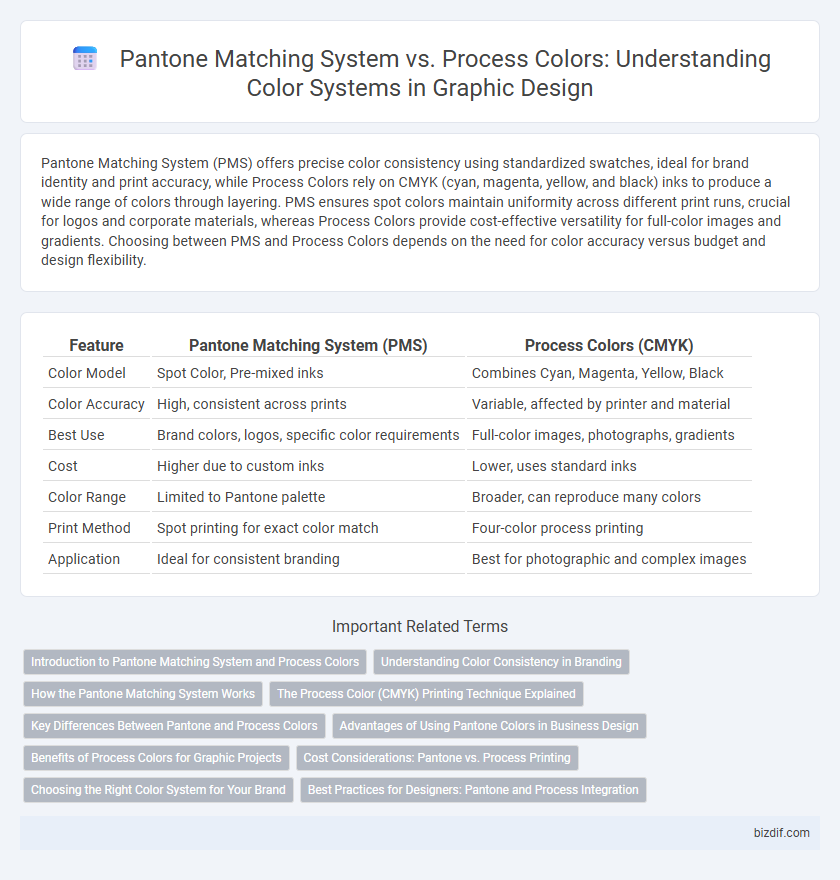
Table of Comparison
| Feature | Pantone Matching System (PMS) | Process Colors (CMYK) |
|---|---|---|
| Color Model | Spot Color, Pre-mixed inks | Combines Cyan, Magenta, Yellow, Black |
| Color Accuracy | High, consistent across prints | Variable, affected by printer and material |
| Best Use | Brand colors, logos, specific color requirements | Full-color images, photographs, gradients |
| Cost | Higher due to custom inks | Lower, uses standard inks |
| Color Range | Limited to Pantone palette | Broader, can reproduce many colors |
| Print Method | Spot printing for exact color match | Four-color process printing |
| Application | Ideal for consistent branding | Best for photographic and complex images |
Introduction to Pantone Matching System and Process Colors
Pantone Matching System (PMS) is a standardized color reproduction method used in graphic design to ensure color consistency across different materials and printing processes by utilizing pre-mixed, spot colors. Process colors, often referred to as CMYK (Cyan, Magenta, Yellow, and Key/Black), are created by combining four ink colors in varying percentages to produce a broad spectrum of colors through printing. PMS is preferred for precise brand color matching, while process colors offer flexibility and cost-effectiveness for full-color images and complex designs.
Understanding Color Consistency in Branding
Pantone Matching System (PMS) ensures precise color consistency by using standardized, pre-mixed inks, ideal for maintaining exact brand colors across various print materials. Process colors, composed of cyan, magenta, yellow, and black (CMYK), rely on color blending, which can cause slight variations in hue depending on the printer and substrate. Understanding the strengths and limitations of PMS versus process colors is critical for achieving reliable brand color reproduction and preserving visual identity integrity.
How the Pantone Matching System Works
The Pantone Matching System (PMS) works by using a standardized palette of specific, pre-mixed ink colors identified by unique numbers, ensuring consistent color reproduction across various print jobs and materials. Unlike process colors that rely on the CMYK color model and blend cyan, magenta, yellow, and black inks during printing, PMS colors are solid and premixed, eliminating variations caused by ink overlaps or printer calibration. This precise color matching technique is essential for brand consistency, logos, and packaging where exact color fidelity is critical.
The Process Color (CMYK) Printing Technique Explained
Process color printing utilizes the CMYK color model, combining cyan, magenta, yellow, and key (black) inks in varying percentages to produce a wide spectrum of colors. This technique relies on subtractive color mixing, where overlapping dots of each ink layer create the desired tonal range and image depth. Process colors enable efficient, full-color printing for complex designs but may lack the exact color precision provided by the Pantone Matching System.
Key Differences Between Pantone and Process Colors
Pantone Matching System (PMS) utilizes pre-mixed, standardized colors ensuring exact color consistency across different print jobs, whereas process colors rely on a combination of cyan, magenta, yellow, and black (CMYK) inks that blend during printing to produce a wide range of hues. PMS is ideal for brands requiring precise, reproducible colors, especially for logos and corporate identity, while process colors are cost-effective for full-color images and complex graphics. Understanding the distinct applications and limitations of PMS and CMYK process colors is crucial for achieving accurate color representation in graphic design projects.
Advantages of Using Pantone Colors in Business Design
Pantone Matching System (PMS) ensures precise color consistency across various materials and print runs, eliminating color variation issues common with process colors. Businesses benefit from PMS by achieving brand recognition through exact color replication, crucial for maintaining a strong and unified visual identity. Furthermore, Pantone colors simplify communication between designers and printers, reducing errors and production time.
Benefits of Process Colors for Graphic Projects
Process colors, using CMYK (cyan, magenta, yellow, and black), offer significant benefits for graphic projects by enabling a wide spectrum of colors through color mixing, ideal for detailed images and photographs. They provide cost-effective printing on various materials with consistent color reproduction across different printers, ensuring project scalability. The flexibility of process colors supports dynamic visual effects and gradients, enhancing creative potential in branding and marketing materials.
Cost Considerations: Pantone vs. Process Printing
Pantone Matching System (PMS) often incurs higher initial costs due to custom ink mixing and precise color matching, making it ideal for brand consistency in logos and limited color prints. Process colors, utilizing CMYK printing, offer more cost-effective solutions for full-color images and large-volume jobs, but can lead to slight color variations and less exact matches. Choosing between PMS and process printing depends on budget constraints, project requirements, and desired color accuracy.
Choosing the Right Color System for Your Brand
Selecting the appropriate color system for your brand involves understanding the differences between Pantone Matching System (PMS) and Process Colors (CMYK). PMS offers precise, consistent color reproduction ideal for logos and brand identity, ensuring exact color matching across various materials. Process Colors use a combination of cyan, magenta, yellow, and black inks to create a wide range of colors, suited for complex images but may vary slightly in print consistency.
Best Practices for Designers: Pantone and Process Integration
Designers achieve color consistency by integrating Pantone Matching System (PMS) colors with process colors, balancing spot color precision and CMYK print flexibility. Best practices include using PMS for brand-critical elements requiring exact hues and employing process colors for images and complex gradients. Combining these methods ensures vibrant, accurate prints while optimizing production costs and minimizing color variations.
Pantone Matching System vs Process Colors Infographic