Pantone offers a standardized color matching system that ensures consistent and precise color reproduction across different materials and printers, ideal for brand-specific hues. CMYK is a color model used primarily in printing that blends cyan, magenta, yellow, and black inks to create a wide range of colors but can vary depending on the printer and substrate. Choosing Pantone over CMYK is essential when exact color accuracy is critical, while CMYK is more cost-effective for full-color images and general printing.
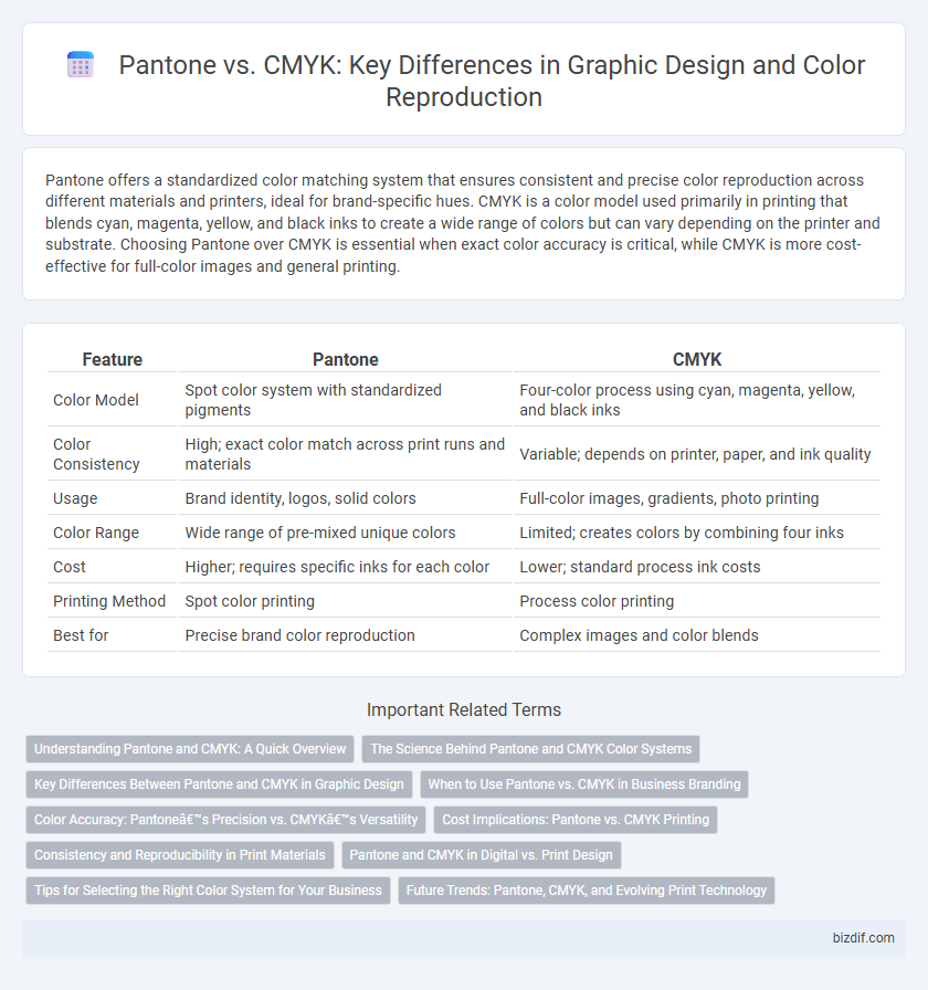
Table of Comparison
| Feature | Pantone | CMYK |
|---|---|---|
| Color Model | Spot color system with standardized pigments | Four-color process using cyan, magenta, yellow, and black inks |
| Color Consistency | High; exact color match across print runs and materials | Variable; depends on printer, paper, and ink quality |
| Usage | Brand identity, logos, solid colors | Full-color images, gradients, photo printing |
| Color Range | Wide range of pre-mixed unique colors | Limited; creates colors by combining four inks |
| Cost | Higher; requires specific inks for each color | Lower; standard process ink costs |
| Printing Method | Spot color printing | Process color printing |
| Best for | Precise brand color reproduction | Complex images and color blends |
Understanding Pantone and CMYK: A Quick Overview
Pantone is a standardized color matching system used in graphic design for precise and consistent color reproduction, relying on a predefined palette of ink colors. CMYK, representing Cyan, Magenta, Yellow, and Key (Black), is a color model used for full-color printing through the combination of these four ink colors. Understanding the differences between Pantone and CMYK is crucial for designers to ensure color accuracy and consistency across various printing processes and materials.
The Science Behind Pantone and CMYK Color Systems
Pantone and CMYK color systems differ fundamentally in their approach to color reproduction, with Pantone using a standardized set of pre-mixed inks to ensure precise and consistent spot colors. CMYK relies on color mixing through cyan, magenta, yellow, and black ink overlays, which can lead to variations in hue depending on the printer and substrate used. The science behind Pantone revolves around color consistency and predictability, while CMYK emphasizes practical full-color printing through subtractive color blending.
Key Differences Between Pantone and CMYK in Graphic Design
Pantone utilizes a standardized color matching system with pre-mixed inks to achieve precise and consistent colors, ideal for brand identity and spot color printing. CMYK relies on four process inks--cyan, magenta, yellow, and black--combined in varying percentages to create a wide gamut of colors, suited for full-color printing and photographic images. The primary difference lies in Pantone's exact color replication versus CMYK's color blending technique, affecting print accuracy and cost efficiency in graphic design projects.
When to Use Pantone vs. CMYK in Business Branding
Pantone colors provide precise and consistent color matching for brand logos, ideal for situations requiring exact color reproduction like printed marketing materials and packaging. CMYK is a four-color process best suited for full-color images and complex designs where color variability is acceptable, often used in brochures and digital print ads. Businesses prioritize Pantone for brand identity to maintain color integrity across various media, while CMYK offers flexibility and cost-effectiveness for diverse promotional materials.
Color Accuracy: Pantone’s Precision vs. CMYK’s Versatility
Pantone delivers unparalleled color accuracy through its standardized color matching system, ensuring brand colors remain consistent across various materials and production processes. In contrast, CMYK offers versatility with its four-color process that can reproduce a wide range of colors but may result in slight variations due to printer calibration and ink absorption. Designers often rely on Pantone for precise color specifications in branding, while CMYK is favored for full-color printing where exact color matches are less critical.
Cost Implications: Pantone vs. CMYK Printing
Pantone printing incurs higher costs due to the use of custom-mixed inks, which requires precise color matching and often limits printing volume. CMYK printing is more cost-effective for large runs, utilizing four standard ink colors that blend to create a wide spectrum, reducing expenses in ink and setup. Businesses aiming for budget-friendly print solutions typically prefer CMYK, while Pantone is chosen for specialized branding needs requiring exact color consistency.
Consistency and Reproducibility in Print Materials
Pantone provides unmatched color consistency by using standardized spot colors matched through a unique code system, ensuring exact color reproduction across different print runs and materials. CMYK relies on a four-color process that can vary due to ink formulation, printer calibration, and substrate differences, resulting in less predictable color accuracy. This makes Pantone the preferred choice for branding projects where precise color matching and repeatability are critical.
Pantone and CMYK in Digital vs. Print Design
Pantone colors offer precise color matching crucial for print design, ensuring brand consistency across physical materials, while CMYK is a four-color process ideal for full-color printing but can struggle with exact color replication. In digital design, RGB is preferred over Pantone and CMYK due to screen light emission, but Pantone guides remain valuable for simulating print colors digitally. Understanding Pantone's spot colors versus CMYK's process colors aids designers in selecting the appropriate color model for accurate reproduction and consistent results in both digital and print mediums.
Tips for Selecting the Right Color System for Your Business
Choosing between Pantone and CMYK depends on the nature of your project and brand consistency needs. Pantone provides precise, standardized colors ideal for logo design and brand identity, ensuring exact color matching across different print jobs. CMYK is suitable for complex images and full-color prints, offering flexibility and cost-effectiveness for marketing materials and large-scale printing.
Future Trends: Pantone, CMYK, and Evolving Print Technology
Pantone continues to lead in brand color consistency with its precise color matching system, essential for maintaining identity in future print applications. CMYK printing evolves through enhanced toner formulations and hybrid techniques, enabling more vibrant and accurate color reproduction on diverse substrates. Advances in digital and 3D printing integrate both Pantone and CMYK standards, driving innovation in customizable and sustainable graphic design solutions.
Pantone vs CMYK Infographic