Pantone colors offer precise, standardized shades that ensure color consistency across various materials, making them ideal for brand identity and specific color matching. Process colors, created using CMYK values, provide a broader range of printable colors by combining cyan, magenta, yellow, and black inks during printing. Choosing between Pantone and process colors depends on project requirements for color accuracy, budget, and print volume.
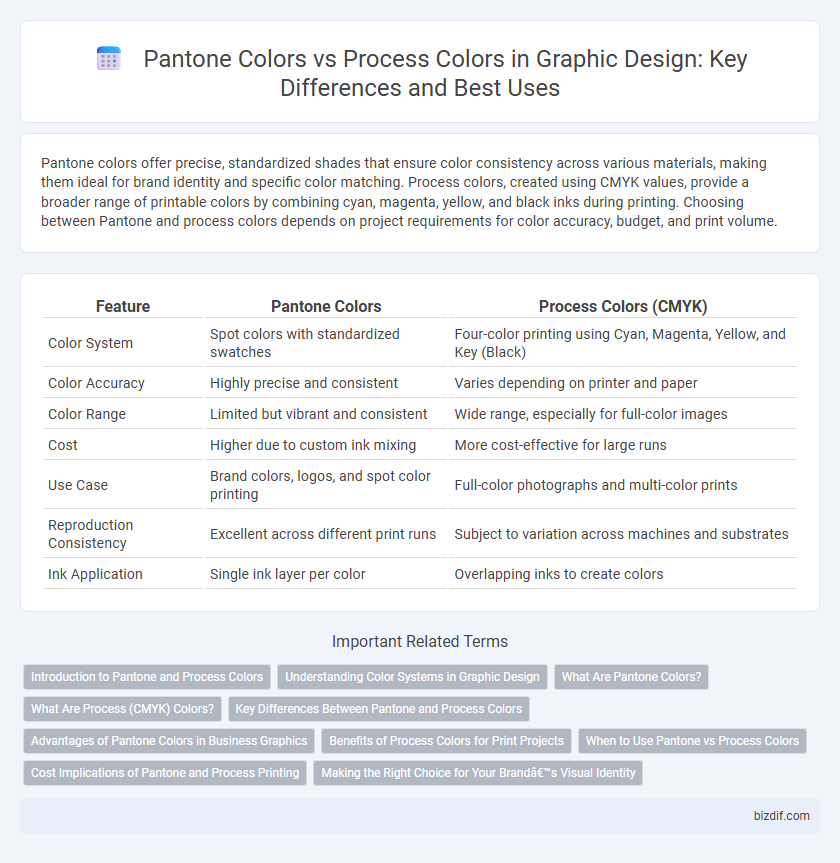
Table of Comparison
| Feature | Pantone Colors | Process Colors (CMYK) |
|---|---|---|
| Color System | Spot colors with standardized swatches | Four-color printing using Cyan, Magenta, Yellow, and Key (Black) |
| Color Accuracy | Highly precise and consistent | Varies depending on printer and paper |
| Color Range | Limited but vibrant and consistent | Wide range, especially for full-color images |
| Cost | Higher due to custom ink mixing | More cost-effective for large runs |
| Use Case | Brand colors, logos, and spot color printing | Full-color photographs and multi-color prints |
| Reproduction Consistency | Excellent across different print runs | Subject to variation across machines and substrates |
| Ink Application | Single ink layer per color | Overlapping inks to create colors |
Introduction to Pantone and Process Colors
Pantone colors are standardized spot colors defined by the Pantone Matching System (PMS), offering precise and consistent hues for branding and print. Process colors, also known as CMYK (Cyan, Magenta, Yellow, and Black), are used in four-color printing to create a wide range of colors by blending these inks in varying proportions. Understanding the differences between Pantone and Process colors is essential for graphic designers to ensure color accuracy and consistency across different media.
Understanding Color Systems in Graphic Design
Pantone colors use a standardized color matching system based on pre-mixed inks, ensuring precise and consistent brand hues across different materials and print runs. Process colors, also known as CMYK (Cyan, Magenta, Yellow, and Black), create a wide spectrum of colors through layering and blending during printing but may vary slightly between devices and print conditions. Understanding the distinction between Pantone and Process colors is essential for graphic designers to achieve accurate color reproduction and maintain brand integrity in printed materials.
What Are Pantone Colors?
Pantone colors, also known as spot colors, are standardized hues created by the Pantone Matching System (PMS) used for precise color reproduction in graphic design and printing. These colors ensure exact color matching across different materials and printing processes, which is critical for brand consistency and high-quality output. Unlike process colors that blend CMYK inks, Pantone colors are pre-mixed inks specifying exact shades, making them ideal for logos and designs requiring consistent color fidelity.
What Are Process (CMYK) Colors?
Process colors, also known as CMYK colors, consist of cyan, magenta, yellow, and black inks used in four-color printing to create a broad spectrum of colors by layering these inks in varying percentages. Unlike Pantone colors, which are premixed spot colors providing exact color matching, CMYK colors rely on the combination of process inks to simulate colors during printing. This subtractive color model is essential for full-color prints and is widely used in commercial printing due to its cost-effectiveness and versatility.
Key Differences Between Pantone and Process Colors
Pantone colors are standardized, premixed inks designed to achieve precise and consistent color matching across different print jobs, whereas Process colors use a combination of cyan, magenta, yellow, and black (CMYK) inks to create a broad spectrum through color blending. Pantone colors offer greater color accuracy and vibrancy, especially for spot colors and brand-specific hues, while Process colors are more cost-effective for full-color images and gradients. The key difference lies in Pantone's solid, predictable tones compared to Process colors' variable results based on ink layering and print conditions.
Advantages of Pantone Colors in Business Graphics
Pantone colors ensure precise color matching across various print and digital platforms, enhancing brand consistency in business graphics. Their standardized palette enables designers to reproduce exact hues, which is crucial for maintaining a professional and recognizable brand identity. Using Pantone colors minimizes color variation risks and reduces costly reprints or redesigns, providing reliable visual communication for businesses.
Benefits of Process Colors for Print Projects
Process colors (CMYK) offer precise color control and cost-efficiency for print projects by using a combination of cyan, magenta, yellow, and black inks to create a wide color spectrum. These colors enable consistent color reproduction across different printers and materials, enhancing brand accuracy and visual appeal. The versatility of process colors supports complex designs and gradients, making them ideal for high-volume commercial printing.
When to Use Pantone vs Process Colors
Pantone colors offer precise color matching ideal for brand consistency and projects requiring exact color reproduction across various media, particularly in packaging and logo design. Process colors, composed of CMYK inks, are best suited for full-color printing tasks like magazines and brochures where color range flexibility and cost efficiency are priorities. Choosing between Pantone and process colors depends on the project's need for color accuracy versus budget and color complexity.
Cost Implications of Pantone and Process Printing
Pantone colors often incur higher costs due to the need for custom ink mixing and limited color runs, making them ideal for projects requiring precise brand colors and consistent reproduction. Process colors, using CMYK printing, are generally more cost-effective for full-color jobs since they utilize standard inks and can reproduce a wide range of colors without extra setup fees. Businesses must weigh the budget implications against the desired color accuracy when choosing between Pantone and process printing methods.
Making the Right Choice for Your Brand’s Visual Identity
Pantone colors offer precise, consistent hues ideal for brand identity systems requiring exact color matching across various media, while process colors (CMYK) enable full-color printing through color mixing but may vary between printers and materials. Choosing Pantone ensures brand colors remain uniform in packaging, logos, and promotional materials, reinforcing brand recognition and professionalism. However, process colors provide flexibility and cost-efficiency for complex, multi-colored designs, making the decision dependent on your brand's need for color accuracy versus print versatility.
Pantone colors vs Process colors Infographic