Serif fonts feature small decorative lines at the ends of characters, enhancing readability in printed materials and conveying a traditional, formal tone. Sans-serif fonts lack these embellishments, offering a clean, modern appearance ideal for digital screens and minimalist designs. Choosing between serif and sans-serif depends on the project's purpose, audience, and medium to optimize visual impact and legibility.
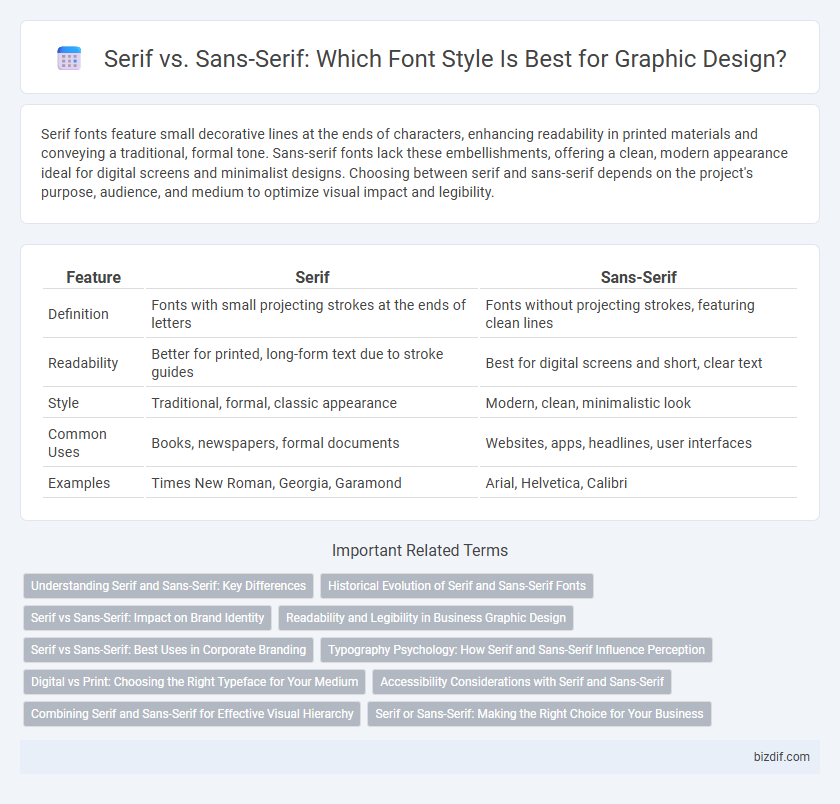
Table of Comparison
| Feature | Serif | Sans-Serif |
|---|---|---|
| Definition | Fonts with small projecting strokes at the ends of letters | Fonts without projecting strokes, featuring clean lines |
| Readability | Better for printed, long-form text due to stroke guides | Best for digital screens and short, clear text |
| Style | Traditional, formal, classic appearance | Modern, clean, minimalistic look |
| Common Uses | Books, newspapers, formal documents | Websites, apps, headlines, user interfaces |
| Examples | Times New Roman, Georgia, Garamond | Arial, Helvetica, Calibri |
Understanding Serif and Sans-Serif: Key Differences
Serif fonts feature small decorative strokes at the ends of letters, enhancing readability in print mediums by guiding the eye along lines of text. Sans-serif fonts lack these strokes, offering a clean and modern appearance that excels in digital displays and minimalistic designs. Choosing between serif and sans-serif depends on the intended use, aesthetic preference, and readability requirements for the specific graphic design project.
Historical Evolution of Serif and Sans-Serif Fonts
Serif fonts originated in ancient Roman inscriptions, characterized by small decorative lines at the ends of letter strokes, symbolizing tradition and readability in print. Sans-serif fonts emerged in the 19th century during the Industrial Revolution, reflecting modernity and simplicity by removing serifs to enhance legibility on digital screens. The historical evolution from serif to sans-serif fonts marks a shift from classical craftsmanship to contemporary minimalism in graphic design typography.
Serif vs Sans-Serif: Impact on Brand Identity
Serif fonts, with their decorative strokes, convey tradition, reliability, and formality, making them ideal for brands seeking to project trust and heritage. Sans-serif fonts offer a clean, modern look that enhances readability and appeals to contemporary, tech-savvy audiences. Choosing between serif and sans-serif significantly influences brand identity by shaping perception and emotional response to the visual communication.
Readability and Legibility in Business Graphic Design
Serif fonts enhance readability in printed business materials by guiding the eye along lines of text, making them ideal for reports and brochures. Sans-serif fonts offer superior legibility on digital screens due to their clean, simple shapes, improving user experience on websites and presentations. Choosing the appropriate font type balances professionalism and clarity, directly impacting communication effectiveness in business graphic design.
Serif vs Sans-Serif: Best Uses in Corporate Branding
Serif fonts convey tradition, reliability, and professionalism, making them ideal for corporate branding in law firms, financial institutions, and established enterprises seeking to project trust and authority. Sans-serif fonts offer a modern, clean, and approachable appearance, often preferred by tech companies, startups, and brands focusing on innovation and simplicity. Choosing between serif and sans-serif depends on the brand's personality and target audience, balancing legibility and emotional impact to strengthen corporate identity.
Typography Psychology: How Serif and Sans-Serif Influence Perception
Serif fonts, characterized by small decorative strokes at the ends of letters, evoke a sense of tradition, reliability, and formality, often reinforcing trustworthiness in printed materials and formal communications. Sans-serif fonts, lacking these embellishments, convey modernity, simplicity, and clarity, making them optimal for digital interfaces and messages requiring straightforward readability. Typography psychology reveals that the choice between serif and sans-serif fonts significantly impacts audience perception, affecting brand identity and emotional response.
Digital vs Print: Choosing the Right Typeface for Your Medium
Serif typefaces enhance readability in print due to their detailed strokes that guide the eye along lines of text, making them ideal for books, newspapers, and magazines. Sans-serif fonts dominate digital screens with clean, simple lines that improve legibility on low-resolution displays and small devices. Selecting the right typeface between serif and sans-serif depends on the medium, balancing visual comfort and clarity for effective communication.
Accessibility Considerations with Serif and Sans-Serif
Sans-serif fonts generally enhance accessibility due to their clean, simple lines that improve readability on digital screens and for individuals with visual impairments. Serif fonts, while often favored in print for readability, can pose challenges for users with dyslexia or low vision, as the additional strokes may create visual clutter. Selecting a typeface with clear letterforms and sufficient spacing is crucial for inclusive design, making sans-serif fonts a preferred choice in many accessibility-focused applications.
Combining Serif and Sans-Serif for Effective Visual Hierarchy
Combining serif and sans-serif fonts creates a clear visual hierarchy by leveraging serif's classic readability for body text and sans-serif's modern clarity for headings. This contrast guides viewers' attention efficiently, enhancing content comprehension and aesthetic balance in graphic design. Strategic use of font pairing improves user engagement and communication effectiveness across digital and print media.
Serif or Sans-Serif: Making the Right Choice for Your Business
Serif fonts, characterized by their decorative strokes at the end of letters, convey tradition, reliability, and professionalism, making them ideal for businesses seeking to establish credibility and trust. Sans-serif fonts offer a clean, modern aesthetic that enhances readability on digital platforms, catering to brands aiming for a contemporary and approachable image. Selecting between serif and sans-serif typography should align with your brand identity, target audience, and medium to effectively communicate your business message.
Serif vs Sans-Serif Infographic