 bizdif.com
 Responsive design uses flexible grids and media queries to create layouts that automatically adjust to different screen sizes, ensuring a seamless user experience across devices. Adaptive design relies on predefined static layouts tailored to specific device widths, delivering optimized performance by detecting the device type in advance. Both approaches aim to enhance usability, but responsive design offers greater fluidity while adaptive design provides more control over design elements for targeted devices.
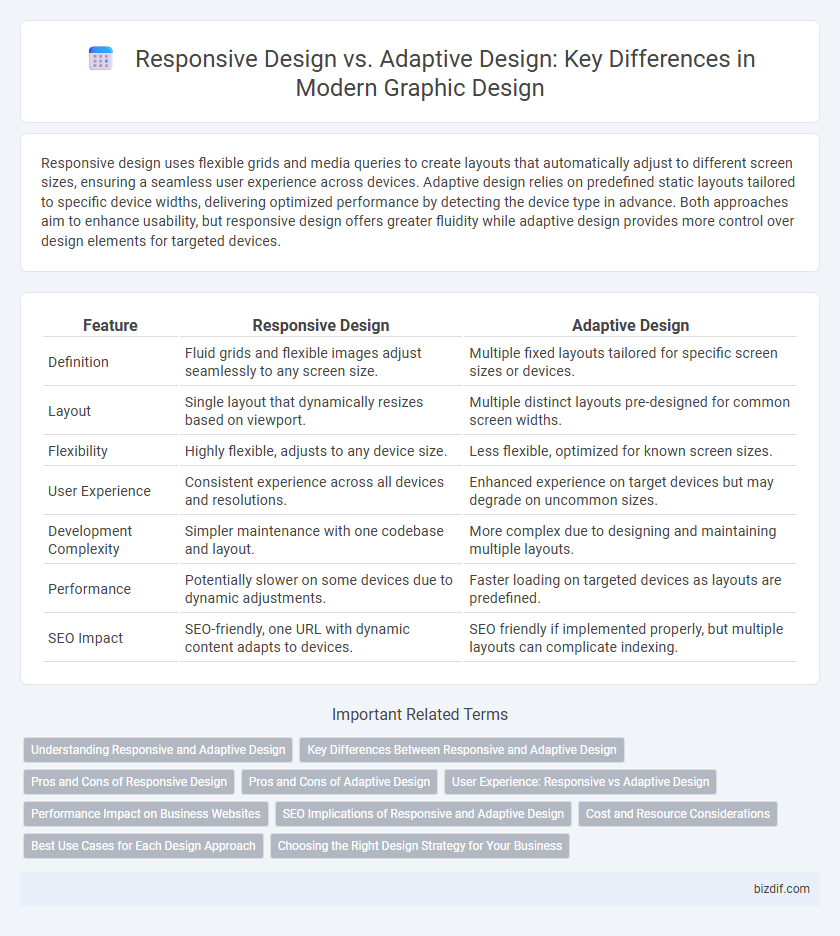
Table of Comparison
| Feature | Responsive Design | Adaptive Design |
|---|---|---|
| Definition | Fluid grids and flexible images adjust seamlessly to any screen size. | Multiple fixed layouts tailored for specific screen sizes or devices. |
| Layout | Single layout that dynamically resizes based on viewport. | Multiple distinct layouts pre-designed for common screen widths. |
| Flexibility | Highly flexible, adjusts to any device size. | Less flexible, optimized for known screen sizes. |
| User Experience | Consistent experience across all devices and resolutions. | Enhanced experience on target devices but may degrade on uncommon sizes. |
| Development Complexity | Simpler maintenance with one codebase and layout. | More complex due to designing and maintaining multiple layouts. |
| Performance | Potentially slower on some devices due to dynamic adjustments. | Faster loading on targeted devices as layouts are predefined. |
| SEO Impact | SEO-friendly, one URL with dynamic content adapts to devices. | SEO friendly if implemented properly, but multiple layouts can complicate indexing. |
Understanding Responsive and Adaptive Design
Responsive design uses flexible grids and media queries to ensure a seamless user experience across all device sizes by automatically adjusting the layout based on screen dimensions. Adaptive design relies on predefined static layouts tailored to specific device categories, delivering optimized experiences for targeted screen sizes. Understanding the differences helps designers choose strategies that enhance usability, performance, and accessibility in diverse browsing environments.
Key Differences Between Responsive and Adaptive Design
Responsive design relies on flexible grids and CSS media queries to create a fluid layout that adjusts seamlessly across all screen sizes. Adaptive design uses predefined fixed layouts tailored for specific device widths, detecting the device to serve the appropriate version. Key differences include responsiveness to screen resizing versus static layout adaptation, impacting user experience consistency and development complexity.
Pros and Cons of Responsive Design
Responsive design ensures a seamless user experience across devices by using flexible grids, images, and media queries, enhancing accessibility and SEO ranking. However, it may face performance issues on complex layouts due to fluid resizing and can require more development time to optimize for all screen sizes. Despite these challenges, responsive design remains a cost-effective, future-proof solution adaptable to new devices without redesigning.
Pros and Cons of Adaptive Design
Adaptive design offers tailored user experiences by creating fixed layouts optimized for specific screen sizes, enhancing performance and usability on targeted devices. However, it requires more development time and maintenance due to multiple layouts, and may lack flexibility for unexpected screen dimensions. This approach excels in environments where predictable device specifications allow precise interface customization.
User Experience: Responsive vs Adaptive Design
Responsive design ensures a seamless user experience by using flexible grids and fluid images that adjust dynamically to any screen size. Adaptive design enhances usability by detecting device-specific characteristics and serving tailored layouts optimized for performance and interaction. Prioritizing user experience, responsive designs offer consistency across devices, while adaptive designs provide precise control for targeted device conditions.
Performance Impact on Business Websites
Responsive design enhances business website performance by fluidly adjusting layouts across all screen sizes, ensuring fast load times and a consistent user experience. Adaptive design uses multiple fixed layouts tailored to specific devices, potentially increasing complexity and load times but offering optimized content delivery. Prioritizing responsive design often results in improved SEO rankings and higher user engagement, directly impacting conversion rates and overall business success.
SEO Implications of Responsive and Adaptive Design
Responsive design improves SEO by providing a single URL and consistent HTML, which enhances crawl efficiency and prevents content duplication. Adaptive design can create multiple URLs for different device versions, potentially leading to duplicate content issues if not managed with canonical tags or redirects. Search engines prioritize mobile-friendly sites, making responsive design generally more beneficial for SEO performance and ranking.
Cost and Resource Considerations
Responsive design typically requires fewer resources and lower costs due to its fluid grid and flexible images that adapt seamlessly across devices without the need for multiple layouts. Adaptive design demands more upfront investment and development time because it involves creating distinct fixed layouts for different screen sizes, increasing complexity and maintenance costs. Choosing between the two should factor in project budget, timeline, and long-term resource allocation for updates and scalability.
Best Use Cases for Each Design Approach
Responsive design excels in creating fluid, scalable layouts that adjust seamlessly across various screen sizes, making it ideal for websites with diverse user devices and unpredictable browsing contexts. Adaptive design works best when targeting specific devices or screen resolutions, delivering tailored experiences by designing distinct layouts for predetermined screen sizes, which enhances performance and user interaction on known devices. Choosing between responsive and adaptive approaches depends largely on the project's flexibility requirements, device targeting, and performance priorities.
Choosing the Right Design Strategy for Your Business
Responsive design uses flexible grids and media queries to ensure a seamless user experience across all devices, ideal for businesses seeking consistent visuals and ease of maintenance. Adaptive design employs multiple fixed layouts tailored to specific screen sizes, offering precise control over user experience that benefits companies targeting distinct device groups. Evaluating your audience's device usage and design goals helps determine whether responsive flexibility or adaptive customization best aligns with your business strategy.
Responsive design vs Adaptive design Infographic