Typeface refers to the design or style of the letters, encompassing the overall artistic style such as Arial or Times New Roman, while font indicates the specific weight, size, and style within that typeface, like Arial Bold 12pt. Understanding the distinction between typeface and font is crucial in graphic design for creating visually consistent and effective layouts. Choosing the right typeface sets the tone of the design, whereas selecting the appropriate font ensures readability and hierarchy.
Table of Comparison
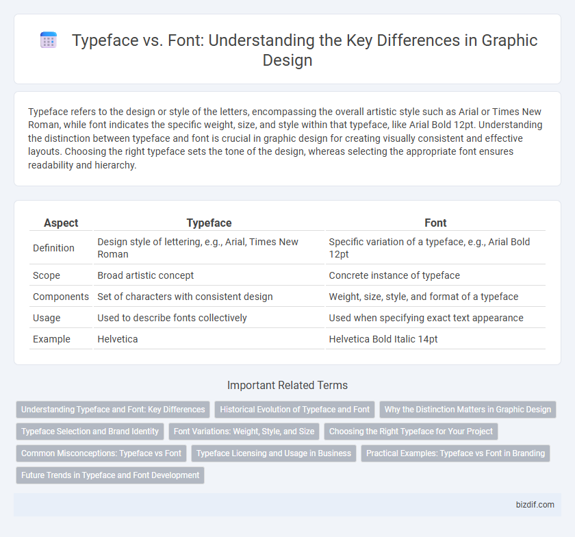
| Aspect | Typeface | Font |
|---|---|---|
| Definition | Design style of lettering, e.g., Arial, Times New Roman | Specific variation of a typeface, e.g., Arial Bold 12pt |
| Scope | Broad artistic concept | Concrete instance of typeface |
| Components | Set of characters with consistent design | Weight, size, style, and format of a typeface |
| Usage | Used to describe fonts collectively | Used when specifying exact text appearance |
| Example | Helvetica | Helvetica Bold Italic 14pt |
Understanding Typeface and Font: Key Differences
A typeface is a set of design features that shapes the overall appearance of characters, encompassing various styles such as bold, italic, and regular. A font specifically refers to the digital or physical file that you use to apply the typeface in design projects, including specific size and weight. Understanding the distinction helps designers select and apply typography precisely for branding, readability, and visual hierarchy in graphic design.
Historical Evolution of Typeface and Font
The historical evolution of typeface and font traces back to movable type printing in the 15th century, where typefaces were defined as distinct letter designs, and fonts referred to specific sizes and styles within those designs. Early typefaces like Garamond and Caslon set foundational standards, evolving through technological advances such as metal type, phototypesetting, and digital typography, which expanded font variations dramatically. Contemporary graphic design leverages this rich history by utilizing diverse digital fonts derived from classic typefaces, blending tradition and innovation in visual communication.
Why the Distinction Matters in Graphic Design
The distinction between typeface and font is crucial in graphic design because typeface refers to the overall design style of characters, while font specifies the particular size, weight, and style within that typeface. Understanding this difference allows designers to maintain visual consistency and effectively communicate brand identity across various media. Precise use of fonts within a chosen typeface enhances readability and aesthetic appeal, directly impacting user experience and engagement.
Typeface Selection and Brand Identity
Typeface selection plays a crucial role in defining brand identity by conveying the company's personality and values through visual style. Choosing a typeface that aligns with the brand's tone enhances recognition and creates a consistent user experience across all marketing materials. Effective typeface selection ensures clear communication and strengthens emotional connections between the brand and its audience.
Font Variations: Weight, Style, and Size
Font variations include weight, style, and size, which are critical for effective graphic design. Weight refers to the thickness of the characters, ranging from thin to bold, impacting visual hierarchy and emphasis. Style encompasses variations like italic or oblique, while size adjusts the overall scale of the font, enhancing readability and aesthetic balance.
Choosing the Right Typeface for Your Project
Selecting the right typeface for your graphic design project hinges on understanding the emotional tone and readability each typeface conveys, as these elements directly impact user engagement. Typeface styles such as serif, sans-serif, script, and display offer distinct visual impressions that align differently with brand identity and message clarity. Prioritize versatility, legibility at various sizes, and compatibility with your project's medium to ensure effective communication and aesthetic harmony.
Common Misconceptions: Typeface vs Font
Many people mistakenly use the terms typeface and font interchangeably, but a typeface refers to the overall design or artistic style of the letterforms, while a font is a specific variation of that typeface, including weight, size, and style (e.g., bold or italic). For example, Helvetica is a typeface, whereas Helvetica Bold 12pt is a font. Understanding this distinction is crucial for graphic designers to communicate precisely and choose appropriate text elements in design projects.
Typeface Licensing and Usage in Business
Typeface licensing dictates the legal usage rights of a typeface, covering design, distribution, and reproduction, while font licensing pertains specifically to the digital files used for typing. Businesses must secure appropriate typeface licenses to avoid intellectual property infringements, especially in commercial projects, advertising, and product packaging. Choosing typefaces with clear, commercial-friendly licenses prevents costly legal disputes and ensures seamless branding consistency across various platforms.
Practical Examples: Typeface vs Font in Branding
In branding, a typeface like Helvetica or Times New Roman defines the overall design style and personality, while a font specifies the weight, size, and style variations such as Helvetica Bold 12pt or Times New Roman Italic 14pt used in marketing materials. Choosing a consistent typeface across logos, packaging, and websites ensures brand cohesion, while selecting the appropriate font variants enhances readability and emphasis in promotional content. Practical examples include Coca-Cola's use of a unique script typeface to convey its identity, paired with specific font weights to maintain visual hierarchy in advertising campaigns.
Future Trends in Typeface and Font Development
Future trends in typeface and font development emphasize variable fonts that offer fluid weight, width, and slant adjustments, enhancing design flexibility. Advances in AI-driven typeface creation enable rapid generation of custom fonts tailored to specific branding needs, pushing personalized typography forward. Responsive typography adapting seamlessly across digital devices ensures optimal readability and user experience in diverse screen environments.
Typeface vs Font Infographic