Spot color uses pre-mixed inks to achieve precise, consistent hues, making it ideal for brand logos and limited color designs. Process color relies on four-color CMYK printing, blending cyan, magenta, yellow, and black to create a wide spectrum of shades, suitable for full-color images and complex graphics. Choosing between spot and process color depends on budget, color accuracy needs, and the project's visual complexity.
Table of Comparison
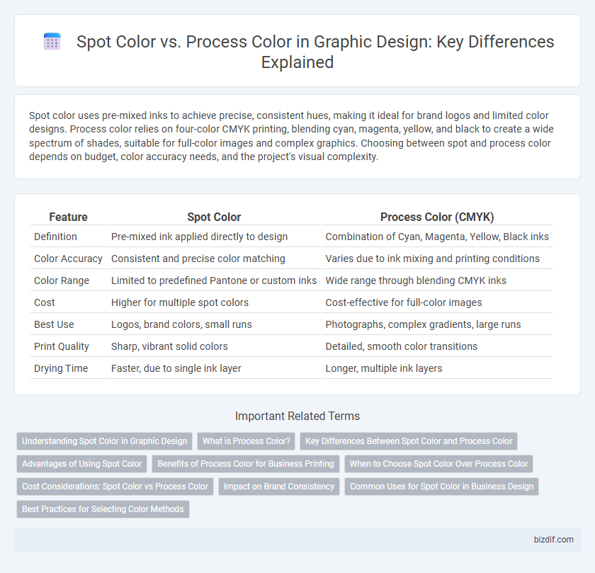
| Feature | Spot Color | Process Color (CMYK) |
|---|---|---|
| Definition | Pre-mixed ink applied directly to design | Combination of Cyan, Magenta, Yellow, Black inks |
| Color Accuracy | Consistent and precise color matching | Varies due to ink mixing and printing conditions |
| Color Range | Limited to predefined Pantone or custom inks | Wide range through blending CMYK inks |
| Cost | Higher for multiple spot colors | Cost-effective for full-color images |
| Best Use | Logos, brand colors, small runs | Photographs, complex gradients, large runs |
| Print Quality | Sharp, vibrant solid colors | Detailed, smooth color transitions |
| Drying Time | Faster, due to single ink layer | Longer, multiple ink layers |
Understanding Spot Color in Graphic Design
Spot color in graphic design refers to the use of pre-mixed inks applied separately from the standard CMYK process, ensuring precise color matching and consistency across printed materials. It is essential for branding projects where exact color reproduction, such as corporate logos or specific Pantone colors, is critical. Spot colors eliminate color variation caused by printing inconsistencies and provide vibrant, solid hues that cannot be replicated accurately with process colors.
What is Process Color?
Process color refers to a printing technique that uses a combination of four standard ink colors--cyan, magenta, yellow, and black (CMYK)--to reproduce a wide spectrum of colors through layering and blending. This method is ideal for full-color images, such as photographs and complex graphics, because it allows for smooth color gradients and detailed shading. Process color is widely used in magazines, brochures, and other print media where vibrant and varied color output is essential.
Key Differences Between Spot Color and Process Color
Spot color uses pre-mixed inks to achieve consistent, precise hues, ideal for brand-specific colors and limited palettes in graphic design. Process color, also known as CMYK, combines cyan, magenta, yellow, and black inks in varying percentages to create a wide range of colors, suitable for full-color images and gradients. Key differences include spot color's accuracy in color matching versus process color's versatility and cost-effectiveness for complex images.
Advantages of Using Spot Color
Spot color offers superior color consistency and precision, ensuring brand colors remain exact across various print materials. It provides vibrant, solid hues that are difficult to achieve with process color printing, particularly for logos and corporate identity designs. Using spot colors can also reduce printing costs for jobs requiring limited colors by minimizing ink overlap and drying time.
Benefits of Process Color for Business Printing
Process color printing uses a combination of cyan, magenta, yellow, and black (CMYK) inks to produce a full spectrum of colors, enabling businesses to create vibrant, detailed images that enhance brand appeal. This method offers cost-effective solutions for high-volume print jobs, reducing expenses associated with spot colors and simplifying the printing process. Process color ensures consistent, accurate color reproduction across various print materials, supporting cohesive marketing efforts and professional-quality outcomes.
When to Choose Spot Color Over Process Color
Spot color is ideal when precise color matching is crucial, such as branding logos or corporate identity materials requiring consistent and specific hues. Use spot color for designs with limited colors to ensure vibrant, solid coverage and avoid the potential color variations that can occur with process color printing. Spot color is also preferred for printing on non-white substrates or specialty materials, where process color inks may not reproduce accurately.
Cost Considerations: Spot Color vs Process Color
Spot color printing typically costs more due to the need for custom-mixed inks and separate printing plates, making it ideal for projects with limited color palettes or precise brand colors. Process color, using CMYK four-color printing, offers a cost-effective solution for complex, multicolor images by blending standard inks, reducing setup expenses. Budget-conscious graphic design projects with extensive color gradients often favor process color to balance vibrancy and affordability.
Impact on Brand Consistency
Spot color ensures precise brand color matching by using pre-mixed inks, maintaining consistent visual identity across print materials. Process color, created by blending CMYK inks, can vary slightly between printers or substrates, risking slight deviations in brand hues. Choosing spot color for key brand elements reinforces uniformity and strengthens brand recognition in all printed media.
Common Uses for Spot Color in Business Design
Spot color is commonly used in business design for logos, brand identity, and promotional materials where precise color matching is critical. It ensures brand consistency across various print media by using pre-mixed inks that produce exact hues unattainable with process color mixing. Spot color is ideal for printing on specialty materials like packaging, labels, and corporate stationery, maintaining vibrancy and durability.
Best Practices for Selecting Color Methods
Spot color provides precise color matching by using pre-mixed inks, ideal for brand consistency and limited color runs, while process color utilizes CMYK printing for full-color images and gradients, offering cost-effectiveness in multi-color projects. Selecting the appropriate method depends on factors like budget, design complexity, and desired color fidelity, with spot colors excelling in logos and packaging, and process colors suited for photographic and detailed artwork. Designers should collaborate closely with printers to ensure color accuracy and choose inks that meet the project's technical and aesthetic requirements.
Spot Color vs Process Color Infographic