Typography hierarchy organizes text elements based on font size, weight, and style to guide readers through content clearly. Visual hierarchy encompasses all design elements, including typography, color, and layout, to prioritize information effectively. Understanding the distinction ensures designers create intuitive and engaging user experiences.
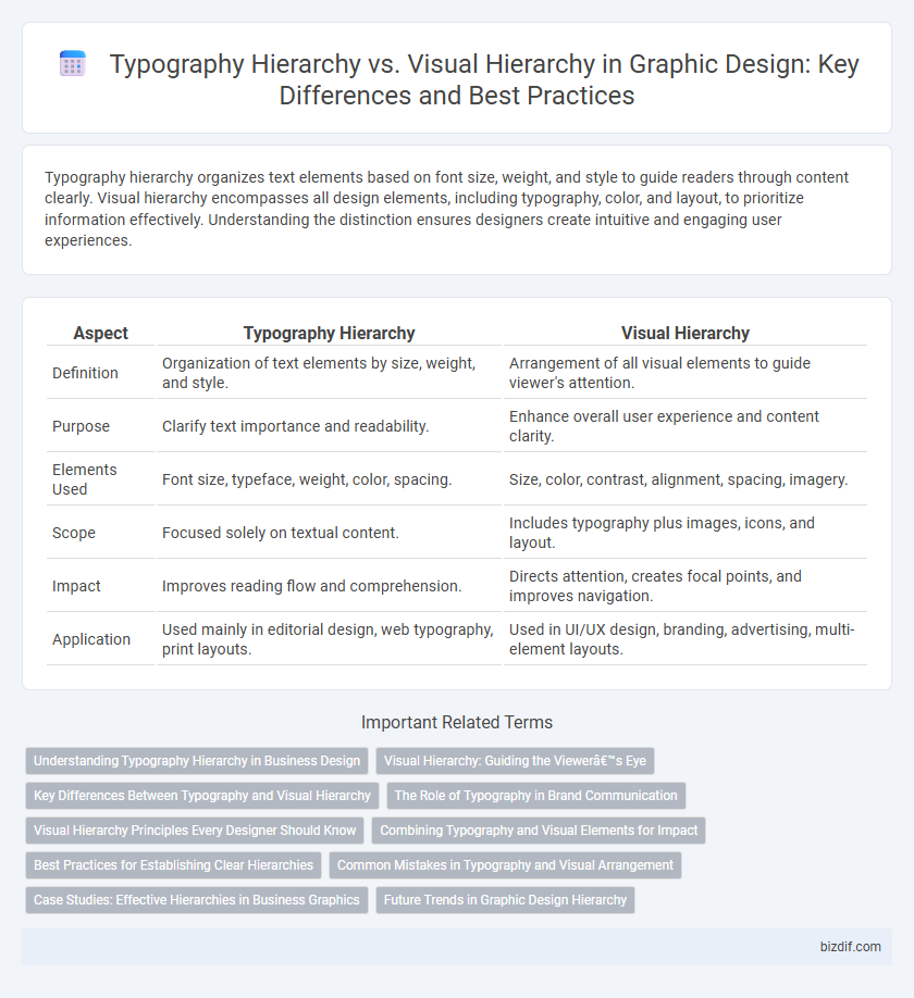
Table of Comparison
| Aspect | Typography Hierarchy | Visual Hierarchy |
|---|---|---|
| Definition | Organization of text elements by size, weight, and style. | Arrangement of all visual elements to guide viewer's attention. |
| Purpose | Clarify text importance and readability. | Enhance overall user experience and content clarity. |
| Elements Used | Font size, typeface, weight, color, spacing. | Size, color, contrast, alignment, spacing, imagery. |
| Scope | Focused solely on textual content. | Includes typography plus images, icons, and layout. |
| Impact | Improves reading flow and comprehension. | Directs attention, creates focal points, and improves navigation. |
| Application | Used mainly in editorial design, web typography, print layouts. | Used in UI/UX design, branding, advertising, multi-element layouts. |
Understanding Typography Hierarchy in Business Design
Typography hierarchy guides viewers through business design by prioritizing text elements based on size, weight, and style, ensuring key messages capture attention first. It enhances readability and brand identity by structuring content from headlines to body text in a clear, logical sequence. Effective typography hierarchy supports visual hierarchy but specifically emphasizes typographic elements to convey information efficiently and attractively.
Visual Hierarchy: Guiding the Viewer’s Eye
Visual hierarchy in graphic design strategically arranges elements to guide the viewer's eye through content, emphasizing the most important information first. Techniques like size variation, color contrast, and spacing create clear focal points and improve readability. This approach ensures effective communication by prioritizing visual flow over rigid typographic structures.
Key Differences Between Typography and Visual Hierarchy
Typography hierarchy organizes text elements by font size, weight, and style to guide readers through content logically, enhancing readability and comprehension. Visual hierarchy encompasses all design elements, including color, contrast, spacing, and imagery, to direct viewer attention and prioritize information across the entire layout. The key difference lies in typography hierarchy's exclusive focus on text presentation, while visual hierarchy integrates multiple design aspects to shape overall user experience.
The Role of Typography in Brand Communication
Typography hierarchy structures textual content by prioritizing font size, weight, and style, guiding readers through brand messages with clarity and emphasis. Visual hierarchy integrates typography with images, color, and layout to create a cohesive brand identity that captures attention and conveys intended emotions. Strategic use of typography in brand communication enhances recognition, establishes tone, and ensures consistent messaging across diverse media platforms.
Visual Hierarchy Principles Every Designer Should Know
Visual hierarchy principles guide designers in organizing elements to direct the viewer's attention effectively through contrast, size, color, and spacing. Emphasizing dominant elements helps establish a clear flow, ensuring key messages are prioritized and easily absorbed. Mastery of visual hierarchy optimizes readability and user engagement, crucial for impactful graphic design projects.
Combining Typography and Visual Elements for Impact
Typography hierarchy organizes text by size, weight, and style to guide readers through content efficiently, while visual hierarchy arranges all design elements--including images and colors--to direct attention strategically. Combining typography and visual elements enhances user experience by creating clear focal points and improving readability, making information easier to process and remember. Effective integration of these hierarchies ensures designs are both aesthetically pleasing and functionally impactful, driving engagement and communication success.
Best Practices for Establishing Clear Hierarchies
Typography hierarchy is the strategic use of font size, weight, and spacing to guide readers through content, ensuring important information stands out clearly. Visual hierarchy expands beyond typography to include elements like color, contrast, and layout, creating an overall ordering of information that directs user attention effectively. Best practices for establishing clear hierarchies involve combining consistent typographic scales with contrasting visual elements to enhance readability and user engagement.
Common Mistakes in Typography and Visual Arrangement
Common mistakes in typography hierarchy include inconsistent font sizes and neglecting contrast, which can confuse readers and disrupt information flow. Visual hierarchy errors often involve poor alignment and overcrowded layouts, diminishing clarity and engagement. Prioritizing clear distinctions between headings, subheadings, and body text alongside balanced spacing enhances both readability and user experience in graphic design.
Case Studies: Effective Hierarchies in Business Graphics
Typography hierarchy in business graphics organizes text elements by size, weight, and style to guide viewers through information efficiently, while visual hierarchy incorporates color, spacing, and layout to direct overall attention. Case studies reveal that successful brands like Apple and IBM implement typography hierarchy to highlight key messages, whereas visual hierarchy enhances user experience through balanced design and focal points. These hierarchies together optimize communication clarity and brand identity in corporate presentations and marketing materials.
Future Trends in Graphic Design Hierarchy
Typography hierarchy establishes a clear structure through font size, weight, and style to guide readers' attention in graphic design. Visual hierarchy incorporates additional elements such as color, spacing, and imagery to create a more dynamic and engaging user experience. Future trends in graphic design hierarchy emphasize integrating responsive typography with adaptive visual elements to enhance readability across diverse digital platforms.
Typography hierarchy vs Visual hierarchy Infographic