Flat design emphasizes simplicity and minimalism using clean lines, bold colors, and two-dimensional elements, creating a modern and easily navigable interface. Skeuomorphic design mimics real-world textures and objects with detailed shadows and gradients to enhance familiarity and user engagement. Choosing between flat and skeuomorphic design depends on the project's goals, audience preferences, and desired user experience.
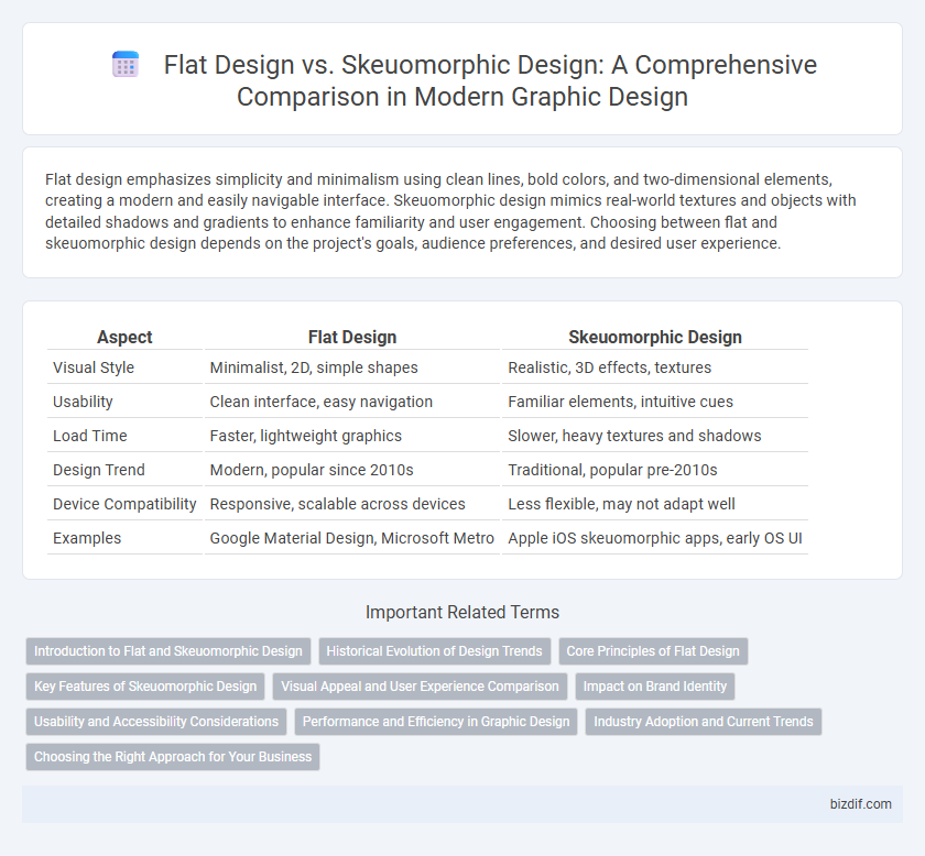
Table of Comparison
| Aspect | Flat Design | Skeuomorphic Design |
|---|---|---|
| Visual Style | Minimalist, 2D, simple shapes | Realistic, 3D effects, textures |
| Usability | Clean interface, easy navigation | Familiar elements, intuitive cues |
| Load Time | Faster, lightweight graphics | Slower, heavy textures and shadows |
| Design Trend | Modern, popular since 2010s | Traditional, popular pre-2010s |
| Device Compatibility | Responsive, scalable across devices | Less flexible, may not adapt well |
| Examples | Google Material Design, Microsoft Metro | Apple iOS skeuomorphic apps, early OS UI |
Introduction to Flat and Skeuomorphic Design
Flat design emphasizes minimalism and simplicity, using bold colors, clean typography, and two-dimensional elements without intricate details or textures. Skeuomorphic design aims to mimic real-world objects with detailed textures, shadows, and three-dimensional effects to create familiarity and depth. Understanding these design philosophies helps designers choose the appropriate style based on user experience goals and interface functionality.
Historical Evolution of Design Trends
Flat design emerged in the early 2010s as a response to the heavy realism of skeuomorphic design, emphasizing simplicity, clean lines, and minimalism. Skeuomorphic design, popularized in the late 2000s particularly through Apple's iOS interfaces, relied on realistic textures and 3D effects to mimic physical objects. The shift from skeuomorphic to flat design marked a significant evolution in user interface aesthetics, driven by the need for faster load times and more adaptable designs across various screen sizes.
Core Principles of Flat Design
Flat design emphasizes minimalism by using simple shapes, bold colors, and clean typography to create a user-friendly interface that enhances readability and usability. It avoids the use of gradients, shadows, and textures common in skeuomorphic design, focusing instead on clarity and functionality. Core principles include simplicity, two-dimensional elements, and a strong focus on usability across various digital platforms.
Key Features of Skeuomorphic Design
Skeuomorphic design prioritizes realism by mimicking real-world textures, shadows, and materials to create a sense of familiarity and depth. It employs detailed icons, gradients, and tactile visuals to make digital interfaces feel tangible. This approach enhances user experience by leveraging intuitive, lifelike elements that guide interaction naturally.
Visual Appeal and User Experience Comparison
Flat design emphasizes simplicity and minimalism, using bold colors, clean lines, and two-dimensional elements that enhance visual clarity and reduce cognitive load for users. Skeuomorphic design incorporates textures, shadows, and realistic details to create familiarity and a tactile experience, which can improve intuitive navigation but may clutter the interface. User experience often benefits from flat design's faster load times and straightforward interactions, while skeuomorphic design can evoke emotional engagement by mimicking real-world objects.
Impact on Brand Identity
Flat design fosters a modern, clean aesthetic that enhances brand identity by promoting simplicity and usability, which appeals to digital-savvy audiences. Skeuomorphic design creates a more tactile and familiar experience, reinforcing brand trust through realistic textures and details that resonate emotionally with users. Brands must align their design choice with target audience preferences to ensure consistent and effective visual communication.
Usability and Accessibility Considerations
Flat design enhances usability by offering clean, simple interfaces with high contrast and clear typography, making navigation intuitive for users and improving screen reader compatibility. Skeuomorphic design, while visually rich and familiar by mimicking real-world objects, can sometimes hinder accessibility due to intricate details and lower contrast, potentially confusing users with cognitive impairments. Prioritizing accessibility, flat design supports better scalability and adaptability across diverse devices, ensuring a consistent experience for users with varying needs.
Performance and Efficiency in Graphic Design
Flat design enhances performance and efficiency in graphic design by using simple shapes, minimal colors, and clean typography, resulting in faster loading times and easier scalability across devices. Skeuomorphic design, with its detailed textures and shadows, often demands more processing power and can slow down rendering on lower-end devices. Choosing flat design improves user experience through quicker interactions and streamlined development workflows.
Industry Adoption and Current Trends
Flat design dominates industry adoption due to its minimalist aesthetics, faster load times, and ease of scalability across digital platforms, making it the preferred choice for tech giants like Apple and Google. Skeuomorphic design, once popular for intuitive interfaces mimicking real-world objects, has seen a decline but remains relevant in niche applications such as financial and educational software where realism enhances user experience. Current trends favor hybrid approaches that blend flat design's simplicity with subtle skeuomorphic elements to create visually appealing yet functional user interfaces.
Choosing the Right Approach for Your Business
Flat design offers a clean, minimalist aesthetic that enhances user experience through simplicity and faster load times, making it ideal for modern digital interfaces. Skeuomorphic design provides a more tactile, realistic feel that can create familiarity and emotional connection, often benefiting brands aiming to evoke trust and nostalgia. Selecting the right approach depends on your target audience, brand identity, and the context in which the design will be used, ensuring alignment with your business goals and user expectations.
Flat design vs Skeuomorphic design Infographic