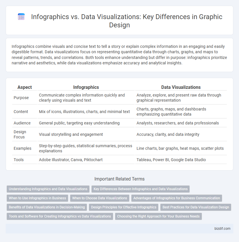
Infographics combine visuals and concise text to tell a story or explain complex information in an engaging and easily digestible format. Data visualizations focus on representing quantitative data through charts, graphs, and maps to reveal patterns, trends, and correlations. Both tools enhance understanding but differ in purpose: infographics prioritize narrative and aesthetics, while data visualizations emphasize accuracy and analytical insights.
Table of Comparison
| Aspect | Infographics | Data Visualizations |
|---|---|---|
| Purpose | Communicate complex information quickly and clearly using visuals and text | Analyze, explore, and present raw data through graphical representation |
| Content | Mix of icons, illustrations, charts, and minimal text | Charts, graphs, maps, and dashboards emphasizing quantitative data |
| Audience | General public, targeting easy understanding | Analysts, researchers, and data professionals |
| Design Focus | Visual storytelling and engagement | Accuracy, clarity, and data integrity |
| Examples | Step-by-step guides, statistical summaries, process explanations | Line charts, bar graphs, heat maps, scatter plots |
| Tools | Adobe Illustrator, Canva, Piktochart | Tableau, Power BI, Google Data Studio |
Understanding Infographics and Data Visualizations
Infographics combine visuals, text, and data to present information clearly and engagingly, making complex topics easier to understand. Data visualizations specifically focus on graphical representations of quantitative data, such as charts and graphs, to highlight patterns and trends. Understanding the differences helps designers choose the right method to communicate insights effectively and enhance user comprehension.
Key Differences Between Infographics and Data Visualizations
Infographics combine text, images, and data to tell a comprehensive story, making complex information easily digestible through creative layouts and visual elements. Data visualizations focus primarily on accurately representing numerical data through charts, graphs, or maps, emphasizing clarity and precision for analysis. The key difference lies in infographics' narrative and design-driven approach versus data visualizations' analytical and straightforward presentation of raw data.
When to Use Infographics in Business
Infographics are ideal for businesses aiming to communicate complex information clearly and quickly, especially in marketing materials, reports, and presentations. They enhance audience engagement by combining visuals with concise data storytelling, making key insights more memorable. Use infographics when the goal is to simplify data trends, highlight comparisons, or convey a narrative that supports branding and decision-making.
When to Choose Data Visualizations
Data visualizations are essential when accuracy and clarity in representing complex quantitative data are paramount, such as in scientific research or financial reporting. They enable users to detect trends, patterns, and outliers by transforming raw numbers into easily interpretable charts, graphs, or maps. Selecting data visualizations over infographics ensures that detailed data analysis and decision-making are supported with precise and informative visual tools.
Advantages of Infographics for Business Communication
Infographics enhance business communication by simplifying complex data into visually engaging and easily digestible formats, boosting audience comprehension and retention. They combine text, images, and charts to tell a compelling story that captures attention and facilitates quick decision-making. Infographics are highly shareable across digital platforms, increasing brand visibility and driving customer engagement effectively.
Benefits of Data Visualizations in Decision-Making
Data visualizations enhance decision-making by presenting complex datasets in clear, interpretable formats such as charts and graphs, enabling faster comprehension and more accurate insights. These visual tools facilitate trend identification, pattern recognition, and anomaly detection, which are critical for strategic planning and performance analysis. Integrating data visualizations in business intelligence allows stakeholders to make data-driven decisions with greater confidence and efficiency.
Design Principles for Effective Infographics
Effective infographics rely on clear hierarchy, balanced composition, and cohesive color schemes to guide viewers through complex information effortlessly. Utilizing consistent iconography and strategic white space enhances readability and emphasizes key data points within the design. Emphasizing simplicity and accuracy ensures that infographics convey messages efficiently, distinguishing them from broader data visualizations that may contain denser datasets.
Best Practices for Data Visualization Design
Effective data visualization design prioritizes clarity by using appropriate chart types such as bar graphs for comparisons and line charts for trends, ensuring accurate data representation. Color schemes must enhance readability and highlight key information without overwhelming the viewer, while maintaining consistency across visual elements. Incorporating concise labels and legends supports quick comprehension, transforming complex datasets into intuitive, actionable insights.
Tools and Software for Creating Infographics vs Data Visualizations
Popular tools for creating infographics include Canva, Piktochart, and Venngage, which offer user-friendly templates and drag-and-drop functionality tailored for visually appealing storytelling. In contrast, data visualization software like Tableau, Microsoft Power BI, and D3.js focuses on handling complex datasets, providing interactive charts, graphs, and real-time data analysis capabilities. Choosing between infographic tools and data visualization software depends on whether the goal is to communicate simplified narratives or to explore and present detailed, dynamic data insights.
Choosing the Right Approach for Your Business Needs
Infographics combine text, images, and data to tell a clear story, making them ideal for marketing and educational content. Data visualizations focus on presenting raw data through charts and graphs, best suited for detailed analysis and decision-making processes. Selecting the right approach depends on whether your business goal is to engage and inform a broad audience or to analyze complex information efficiently.
Infographics vs Data Visualizations Infographic