Pantone colors provide a standardized color matching system widely used in graphic design for pets, ensuring consistent reproduction across different materials and printers. Spot colors are pre-mixed inks applied separately during printing, delivering vibrant, precise hues that are often more durable and true to Pantone standards compared to process colors. Choosing Pantone or spot colors depends on the project's requirement for color accuracy, cost efficiency, and printing technique.
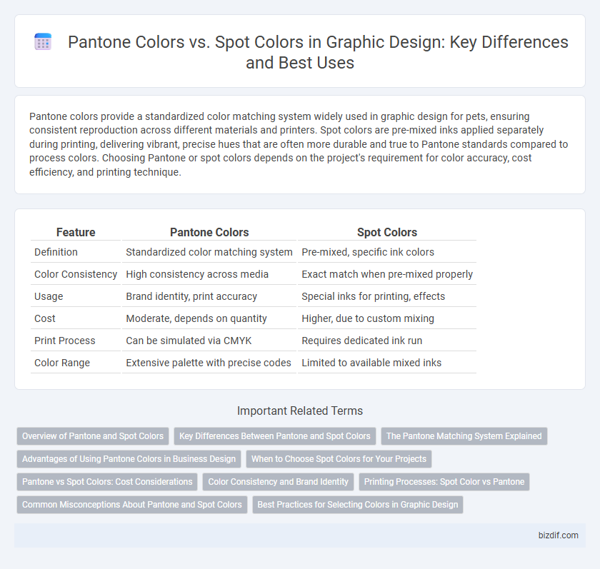
Table of Comparison
| Feature | Pantone Colors | Spot Colors |
|---|---|---|
| Definition | Standardized color matching system | Pre-mixed, specific ink colors |
| Color Consistency | High consistency across media | Exact match when pre-mixed properly |
| Usage | Brand identity, print accuracy | Special inks for printing, effects |
| Cost | Moderate, depends on quantity | Higher, due to custom mixing |
| Print Process | Can be simulated via CMYK | Requires dedicated ink run |
| Color Range | Extensive palette with precise codes | Limited to available mixed inks |
Overview of Pantone and Spot Colors
Pantone colors represent a standardized color matching system used globally to ensure color consistency across various graphic design projects, offering precise color formulas for print and digital media. Spot colors are pre-mixed inks used in printing that provide exact color reproduction, often chosen for brand colors or when color accuracy and vibrancy are essential. While Pantone colors can be applied as spot colors, spot colors also include custom inks beyond the Pantone palette, tailored to specific printing needs.
Key Differences Between Pantone and Spot Colors
Pantone colors are standardized color codes created by the Pantone Matching System (PMS), ensuring consistent color reproduction across different printers and materials, while spot colors refer to premixed inks used in printing to achieve specific colors that standard CMYK cannot replicate. Pantone colors provide a universal color language ideal for branding, whereas spot colors are often customized for specific print jobs, offering precise color matching but less consistency across different print runs. The key difference lies in Pantone's role as a standardized color system and spot colors' function as specific, premixed inks chosen for unique print applications.
The Pantone Matching System Explained
The Pantone Matching System (PMS) is a standardized color reproduction system widely used in graphic design to ensure color consistency across different materials and printers. Unlike spot colors, which are pre-mixed inks applied directly to the substrate, Pantone colors are identified by unique codes that facilitate precise color matching in both digital and print workflows. PMS improves accuracy in branding and packaging by enabling designers and manufacturers to communicate exact hues without variation.
Advantages of Using Pantone Colors in Business Design
Pantone colors offer unmatched consistency and accuracy across various printing processes, ensuring brand colors remain true and recognizable in every application. The standardized Pantone Matching System simplifies communication between designers and printers, reducing errors and streamlining production workflow. Utilizing Pantone colors enhances brand identity reliability, crucial for maintaining a professional and cohesive business design.
When to Choose Spot Colors for Your Projects
Spot colors are ideal for projects requiring precise color matching, such as logos and branding materials, ensuring brand consistency across various print runs. They deliver vibrant, solid hues that Pantone colors in CMYK sometimes cannot replicate accurately. Choosing spot colors reduces color variation and improves print quality when specific shades are critical to the design's impact.
Pantone vs Spot Colors: Cost Considerations
Pantone colors typically involve higher initial costs due to the need for custom ink formulation, while spot colors offer more cost-efficiency in large print runs by using pre-mixed inks. Spot colors reduce the need for multiple color separations, lowering printing expenses and maintaining color consistency. Choosing between Pantone and spot colors depends on budget constraints, print volume, and desired color accuracy in graphic design projects.
Color Consistency and Brand Identity
Pantone colors provide a standardized color system ensuring precise color matching across different materials and printing processes, which is essential for maintaining color consistency in brand identity. Spot colors are pre-mixed inks used in printing to achieve exact hues that cannot be replicated by standard CMYK blends, supporting consistent reproduction of specific brand colors. Utilizing Pantone or spot colors helps brands maintain visual integrity and recognition by delivering uniform color quality across various platforms and products.
Printing Processes: Spot Color vs Pantone
Pantone colors are standardized hues from the Pantone Matching System used to ensure color consistency across various printing processes, making them ideal for brand colors and precise color matching. Spot colors involve pre-mixed inks applied separately from CMYK, providing vibrant hues and solid color coverage that Pantone colors often represent. In printing processes, choosing between Pantone and spot colors depends on factors like color accuracy, cost, and the number of colors needed for production runs.
Common Misconceptions About Pantone and Spot Colors
Many designers mistakenly believe Pantone colors are the only type of spot colors, but Pantone is actually a standardized color matching system within a broader category of spot colors. Spot colors refer to pre-mixed inks used for precise color reproduction, while Pantone offers a standardized palette ensuring consistent color communication across different materials and printing processes. Confusion often arises from equating Pantone with all spot colors, overlooking other proprietary and custom spot color sets used in printing industries.
Best Practices for Selecting Colors in Graphic Design
Pantone colors offer precise color matching through standardized formulas, ideal for brand consistency and print accuracy, while spot colors provide vibrant, single-ink hues that reduce ink usage and ensure color uniformity in limited palettes. Best practices for selecting colors in graphic design involve considering the final production method, such as digital versus offset printing, and evaluating color gamut limitations to maintain design integrity. Designers should collaborate with printers early to choose between Pantone and spot colors based on cost, color fidelity, and project requirements to achieve optimal visual results.
Pantone colors vs spot colors Infographic