Infographic design combines visuals and concise text to communicate information quickly and effectively, making complex data more engaging and accessible. Data visualization emphasizes the accurate representation of data sets through charts, graphs, and maps, focusing on clarity and analytical insight. Both techniques enhance understanding but serve different purposes: infographics for storytelling and data visualization for in-depth analysis.
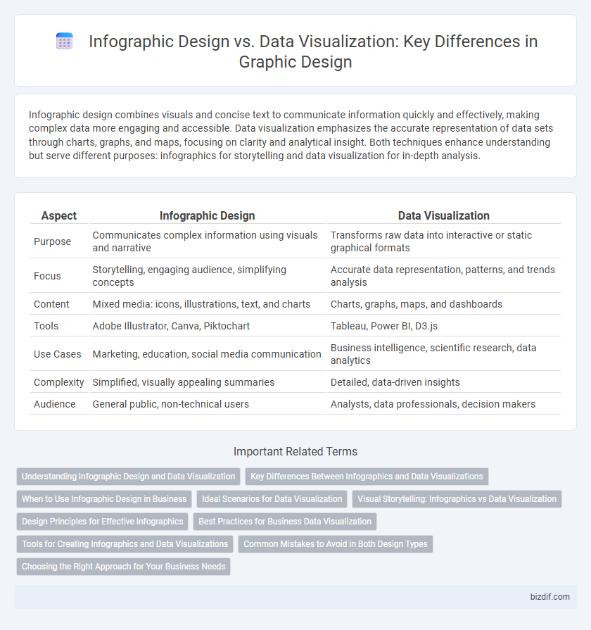
Table of Comparison
| Aspect | Infographic Design | Data Visualization |
|---|---|---|
| Purpose | Communicates complex information using visuals and narrative | Transforms raw data into interactive or static graphical formats |
| Focus | Storytelling, engaging audience, simplifying concepts | Accurate data representation, patterns, and trends analysis |
| Content | Mixed media: icons, illustrations, text, and charts | Charts, graphs, maps, and dashboards |
| Tools | Adobe Illustrator, Canva, Piktochart | Tableau, Power BI, D3.js |
| Use Cases | Marketing, education, social media communication | Business intelligence, scientific research, data analytics |
| Complexity | Simplified, visually appealing summaries | Detailed, data-driven insights |
| Audience | General public, non-technical users | Analysts, data professionals, decision makers |
Understanding Infographic Design and Data Visualization
Infographic design combines visual elements, typography, and concise text to communicate complex information clearly and attractively, making data easier to understand for a broad audience. Data visualization focuses on representing quantitative data graphically through charts, graphs, and maps to reveal patterns, trends, and insights for analytical purposes. Understanding the distinctions allows designers to select the appropriate approach for effective storytelling and data communication.
Key Differences Between Infographics and Data Visualizations
Infographic design combines visuals, text, and data to create a compelling narrative that simplifies complex information for a broad audience, often incorporating illustrations and icons for storytelling. Data visualization focuses on presenting raw data through charts, graphs, and maps to reveal patterns, trends, and insights, prioritizing clarity and accuracy. Key differences lie in infographics' emphasis on engaging, multi-faceted communication versus data visualizations' goal of precise, analytical representation.
When to Use Infographic Design in Business
Infographic design is ideal for businesses aiming to communicate complex information quickly and effectively through visually engaging layouts that combine text, icons, and graphics. It works best for marketing materials, educational content, and brand storytelling where simplifying data trends into digestible visuals enhances audience understanding and retention. Utilizing infographic design in business presentations or social media campaigns increases engagement by transforming detailed data into compelling visual narratives.
Ideal Scenarios for Data Visualization
Data visualization excels in scenarios requiring clear communication of complex datasets, enabling patterns and trends to be quickly understood through charts, graphs, and maps. It is ideal for business analytics, scientific research, and performance tracking where precise data interpretation drives decision-making. Effective data visualization enhances insight generation and supports evidence-based strategies by transforming raw data into actionable visual stories.
Visual Storytelling: Infographics vs Data Visualization
Infographic design employs visual storytelling by combining graphics, icons, and structured layouts to simplify complex information, enhancing engagement and comprehension. Data visualization focuses on presenting raw data through charts, graphs, and maps to reveal patterns, trends, and insights with precision. Both techniques translate data into visual formats, but infographics emphasize narrative flow and context while data visualization prioritizes analytical clarity and depth.
Design Principles for Effective Infographics
Effective infographic design prioritizes clarity, balance, and hierarchy to communicate complex information quickly and visually. Data visualization emphasizes accurate representation of data through charts and graphs, ensuring integrity and precise interpretation. Both approaches benefit from consistent color schemes, readable typography, and strategic use of white space to enhance user engagement and comprehension.
Best Practices for Business Data Visualization
Effective business data visualization prioritizes clarity by using simple, clean charts and consistent color schemes that highlight key data points without overwhelming the viewer. Infographic design enhances storytelling by combining visuals and text to guide the audience through complex information, but best practices demand that data accuracy and source transparency remain paramount. Employing interactive elements and responsive layouts further ensures business stakeholders can engage deeply with the data for informed decision-making.
Tools for Creating Infographics and Data Visualizations
Popular tools for infographic design include Canva, Piktochart, and Visme, which offer user-friendly interfaces and customizable templates for creating visually appealing and informative graphics. For data visualization, platforms like Tableau, Power BI, and D3.js provide advanced capabilities to analyze, manipulate, and present complex datasets interactively. Choosing the right tool depends on the balance needed between aesthetic design and data-driven insights, with some software like Adobe Illustrator bridging both fields effectively.
Common Mistakes to Avoid in Both Design Types
Common mistakes in infographic design and data visualization include cluttered layouts that overwhelm viewers, misuse of color schemes that reduce readability, and inaccurate or misleading data representation that hampers comprehension. Designers often neglect user experience by failing to prioritize key information and employing complex jargon or symbols without clear explanation. Ensuring clarity, consistency, and accuracy in visual elements improves engagement and effectively communicates the intended message.
Choosing the Right Approach for Your Business Needs
Infographic design simplifies complex information into visually appealing narratives, making it ideal for marketing and educational purposes by capturing audience attention quickly. Data visualization focuses on accurately representing data sets through charts and graphs, facilitating detailed analysis and informed decision-making in business contexts. Selecting the right approach depends on your goals: use infographics for storytelling and engagement, and data visualization for insights and performance tracking.
Infographic Design vs Data Visualization Infographic