Typography conveys personality and tone through font style, size, and spacing, making it essential for brand identity and readability in graphic design. Iconography uses simple visual symbols to communicate ideas quickly and universally, enhancing user experience by providing instant recognition. Balancing typography and iconography ensures clear, engaging, and effective visual communication in pet-related graphic design projects.
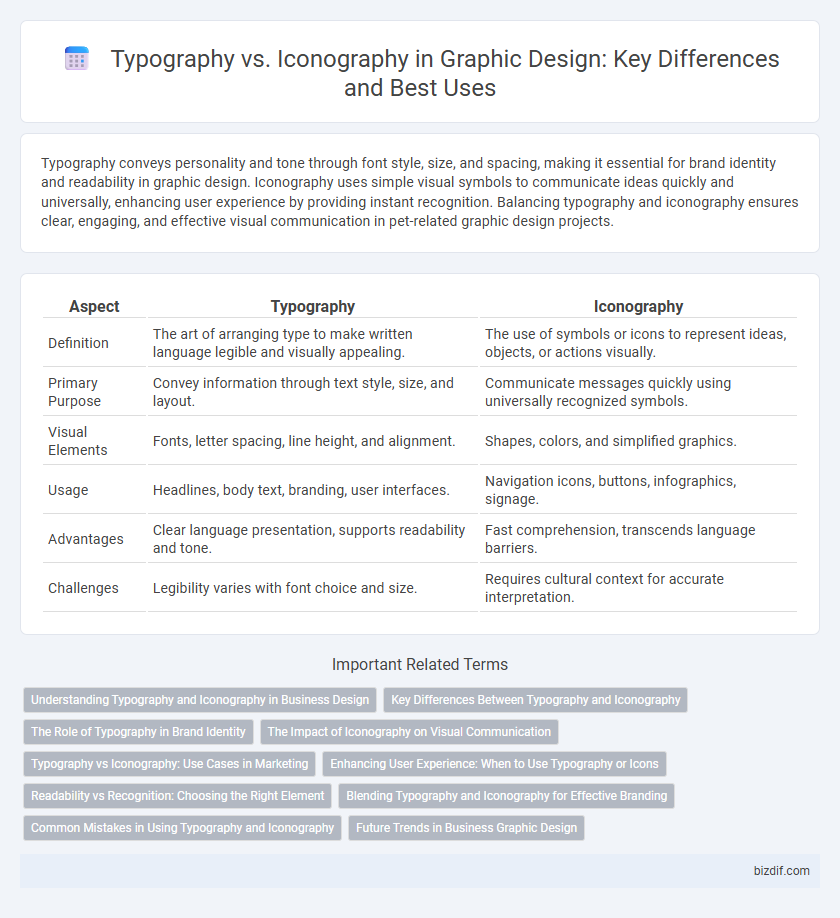
Table of Comparison
| Aspect | Typography | Iconography |
|---|---|---|
| Definition | The art of arranging type to make written language legible and visually appealing. | The use of symbols or icons to represent ideas, objects, or actions visually. |
| Primary Purpose | Convey information through text style, size, and layout. | Communicate messages quickly using universally recognized symbols. |
| Visual Elements | Fonts, letter spacing, line height, and alignment. | Shapes, colors, and simplified graphics. |
| Usage | Headlines, body text, branding, user interfaces. | Navigation icons, buttons, infographics, signage. |
| Advantages | Clear language presentation, supports readability and tone. | Fast comprehension, transcends language barriers. |
| Challenges | Legibility varies with font choice and size. | Requires cultural context for accurate interpretation. |
Understanding Typography and Iconography in Business Design
Typography establishes a brand's voice through font choices, spacing, and hierarchy, enhancing readability and emotional impact in business design. Iconography complements typography by providing visual symbols that communicate complex ideas quickly and reinforce brand identity. Balancing typography and iconography creates cohesive, effective designs that engage audiences and improve user experience.
Key Differences Between Typography and Iconography
Typography emphasizes the arrangement and style of text to enhance readability and convey tone through font choice, size, and spacing. Iconography utilizes visually symbolic images to represent ideas, concepts, or functions succinctly, relying on universally recognizable graphics. Key differences include typography's reliance on language and letters versus iconography's focus on visual symbols and immediate, often language-independent interpretation.
The Role of Typography in Brand Identity
Typography plays a crucial role in brand identity by establishing a consistent visual tone and enhancing brand recognition through carefully chosen fonts, sizes, and spacing. It communicates the brand's personality, values, and professionalism, creating emotional connections with the audience. Effective typography ensures readability and impacts user experience, distinguishing a brand from competitors and reinforcing its message across all marketing materials.
The Impact of Iconography on Visual Communication
Iconography enhances visual communication by conveying complex ideas quickly through universally recognized symbols, improving user comprehension and engagement. Unlike typography, which relies on language and can be limited by literacy, icons transcend language barriers and provide immediate context in design interfaces and branding. Strategic use of iconography elevates brand identity and user experience by creating memorable, intuitive visuals that support and complement textual content.
Typography vs Iconography: Use Cases in Marketing
Typography excels in conveying brand personality through font styles and hierarchy, making it ideal for creating memorable headlines and readable body text in marketing materials. Iconography enhances user experience by quickly communicating concepts and guiding navigation, particularly effective in digital ads and app interfaces. Combining typography with iconography ensures clear, engaging messages that capture attention and reinforce brand identity across diverse marketing platforms.
Enhancing User Experience: When to Use Typography or Icons
Typography enhances user experience by providing clear, readable information through well-chosen fonts and hierarchy, ideal for conveying detailed content or instructions. Iconography improves usability by offering visually intuitive cues that quickly communicate actions or concepts, perfect for navigation and reducing cognitive load. Combining typography and icons strategically ensures an efficient and engaging interface that caters to diverse user needs.
Readability vs Recognition: Choosing the Right Element
Typography enhances readability by organizing text with font styles, sizes, and spacing to ensure clear communication of information. Iconography relies on universally recognized symbols to promote quick recognition and intuitive navigation, reducing cognitive load. Balancing typography and iconography depends on context, where detailed content benefits from readable text, while simple commands or interfaces excel with instantly recognizable icons.
Blending Typography and Iconography for Effective Branding
Blending typography and iconography creates cohesive visual identities that enhance brand recognition and communicate values effectively. Strategic integration of custom typefaces with unique icons ensures clarity and memorability across digital and print media. This synthesis leverages the strengths of both elements, driving stronger emotional connections and user engagement.
Common Mistakes in Using Typography and Iconography
Common mistakes in typography include using too many fonts, poor kerning, and ignoring hierarchy, which can reduce readability and confuse the message. In iconography, errors such as inconsistent style, unclear symbolism, and lack of scalability undermine visual communication and brand coherence. Effective graphic design requires balancing typography and iconography to enhance clarity and user experience.
Future Trends in Business Graphic Design
Future trends in business graphic design emphasize the seamless integration of typography and iconography to create cohesive brand identities. Variable fonts and dynamic icon sets enable adaptive designs that enhance user engagement across digital platforms. Embracing AI-driven tools allows designers to customize typefaces and icons in real-time, optimizing visual communication for evolving consumer preferences.
Typography vs Iconography Infographic