Serif fonts feature small decorative lines or strokes at the ends of letters, enhancing readability in print and creating a traditional, elegant look. Sans-serif fonts lack these embellishments, offering a clean, modern appearance ideal for digital screens and minimalistic designs. Choosing between serif and sans-serif depends on the desired tone, medium, and audience for a graphic design project.
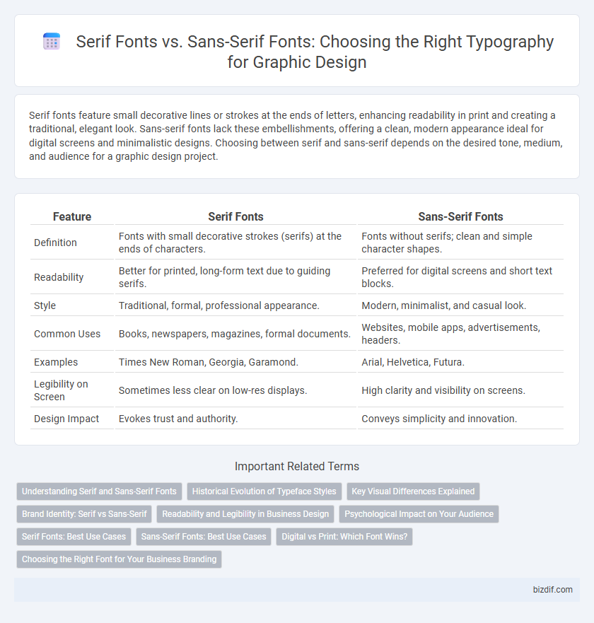
Table of Comparison
| Feature | Serif Fonts | Sans-Serif Fonts |
|---|---|---|
| Definition | Fonts with small decorative strokes (serifs) at the ends of characters. | Fonts without serifs; clean and simple character shapes. |
| Readability | Better for printed, long-form text due to guiding serifs. | Preferred for digital screens and short text blocks. |
| Style | Traditional, formal, professional appearance. | Modern, minimalist, and casual look. |
| Common Uses | Books, newspapers, magazines, formal documents. | Websites, mobile apps, advertisements, headers. |
| Examples | Times New Roman, Georgia, Garamond. | Arial, Helvetica, Futura. |
| Legibility on Screen | Sometimes less clear on low-res displays. | High clarity and visibility on screens. |
| Design Impact | Evokes trust and authority. | Conveys simplicity and innovation. |
Understanding Serif and Sans-Serif Fonts
Serif fonts feature small decorative lines or strokes at the ends of letters, enhancing readability and often used in printed materials like books and newspapers. Sans-serif fonts lack these embellishments, providing a modern, clean appearance ideal for digital screens and user interfaces. Choosing between serif and sans-serif depends on the medium, audience, and desired tone of the graphic design project.
Historical Evolution of Typeface Styles
Serif fonts originated in ancient Roman inscriptions, characterized by small decorative strokes at the end of letterforms, evolving through centuries to convey tradition and formality in print. Sans-serif fonts emerged in the 19th century during the Industrial Revolution, offering a clean, modern aesthetic favored for legibility and digital displays. The historical evolution of these typeface styles mirrors technological advancements and shifting design philosophies from classical print to contemporary digital media.
Key Visual Differences Explained
Serif fonts feature small decorative strokes, or "serifs," at the ends of letterforms, creating a classic and formal appearance that enhances readability in printed materials. Sans-serif fonts lack these strokes, offering a clean, modern look ideal for digital screens and minimalistic designs. The key visual difference lies in the presence or absence of these embellishments, influencing the font's perceived tone and legibility across various media.
Brand Identity: Serif vs Sans-Serif
Serif fonts convey tradition, reliability, and elegance, making them ideal for luxury brands and institutions seeking a classic brand identity. Sans-serif fonts create a modern, clean, and approachable feel, often favored by tech companies and startups aiming for simplicity and digital readability. Brand identity strength relies on aligning font choice with target audience perception, enhancing recognition and emotional connection.
Readability and Legibility in Business Design
Serif fonts enhance legibility in print by guiding the eye along lines of text, making them ideal for formal business documents and reports. Sans-serif fonts offer superior readability on digital screens due to their clean and simple shapes, which reduce eye strain in web and mobile interfaces. Choosing the right font between serif and sans-serif significantly impacts brand communication effectiveness and user engagement in business design.
Psychological Impact on Your Audience
Serif fonts evoke a sense of tradition, reliability, and formality, making them ideal for brands seeking to convey authority and trust. Sans-serif fonts project modernity, clarity, and simplicity, resonating well with audiences looking for innovation and straightforwardness. Understanding these psychological impacts helps designers tailor visual communication to influence audience perception effectively.
Serif Fonts: Best Use Cases
Serif fonts excel in print materials, including books, newspapers, and formal documents, where their small decorative strokes enhance readability by guiding the eye along lines of text. They evoke a sense of tradition, professionalism, and reliability, making them ideal for branding in finance, legal, and editorial industries. Serif fonts also work well in large blocks of text, improving legibility and creating a classic, authoritative aesthetic.
Sans-Serif Fonts: Best Use Cases
Sans-serif fonts excel in digital interfaces and mobile applications due to their clean, modern appearance and superior legibility on screens. They are ideal for body text in websites, user interfaces, and app designs where clarity and readability at various sizes are crucial. Brands aiming for a contemporary, minimalist aesthetic often choose sans-serif typefaces to convey simplicity and professionalism effectively.
Digital vs Print: Which Font Wins?
Serif fonts excel in print due to their decorative strokes, enhancing readability in long passages and traditional media such as books and newspapers. Sans-serif fonts dominate digital platforms with clean, simplified lines that render well on screens and small resolutions, improving legibility in apps and websites. Choosing between serif and sans-serif hinges on the medium: print favors serif for elegance and clarity, while digital prioritizes sans-serif for crispness and user-friendly interface design.
Choosing the Right Font for Your Business Branding
Serif fonts, with their decorative strokes, convey tradition, reliability, and professionalism, making them ideal for businesses in finance, law, or publishing sectors seeking a classic and trustworthy image. Sans-serif fonts offer a clean, modern, and minimalist look, perfect for tech startups, creative agencies, and brands aiming for a contemporary and approachable identity. Selecting the right font enhances brand recognition, communicates core values effectively, and influences customer perception, making font choice a critical element of successful business branding.
Serif fonts vs sans-serif fonts Infographic